Prerequisites
library(tidyverse)Data visualization
Why data visualization?
Exploratory data analysis
Effective,clear communication of information
Stimulate viewer engagement
For an in-depth understanding consider reading this book:
“The Layered Grammar of Graphics” http://vita.had.co.nz/papers/layered-grammar.pdf.
Creating a ggplot
Do cars with big engines use more fuel than cars with small engines?
You can answer with the mpg data frame
in ggplot2.
Among the variables in mpg are:
displ, a car’s engine size, in litres.hwy, a car’s fuel efficiency on the highway, in miles per gallon (mpg). A car with a low fuel efficiency consumes more fuel than a car with a high fuel efficiency when they travel the same distance.
ggplot(data = mpg) +
  geom_point(mapping = aes(x = displ, y = hwy))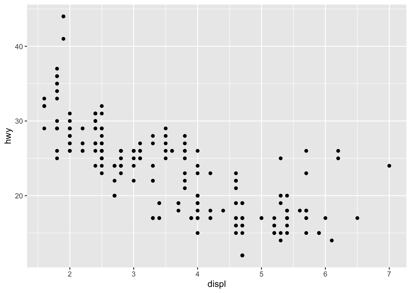
Cars with big engines use more fuel.
ggplot()creates a coordinate system that you can add layers to.
The first argument of ggplot() is the dataset to use in
the graph.
So ggplot(data = mpg) creates an empty
graph.
You complete your graph by adding one or more layers to
ggplot().
- The function
geom_point()adds a layer of points to your plot, which creates a scatterplot.
Each geom function in ggplot2 takes a mapping argument.
This defines how variables in your dataset are mapped to visual
properties.
The mapping argument is always paired with
aes(), and the x and y arguments
of aes() specify which variables to map to the x and y
axes.
A graphing template
ggplot( data = DATA ) + GEOM_FUNCTION ( mapping = aes( MAPPINGS ) )
Aesthetic mappings
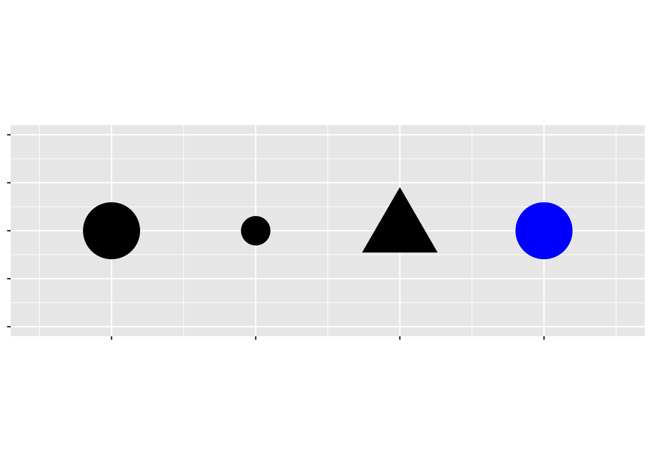
An aesthetic is a visual property of the objects in your plot. Aesthetics include things like the size, the shape, or the color of your points.
You can display a point (like the one below) in different ways by changing the values of its aesthetic properties.
To map an aesthetic to a variable, associate the name of the
aesthetic to the name of the variable inside aes().
ggplot2 will automatically assign a unique level of the aesthetic (here the size) to each unique value of the variable, a process known as SCALING.
ggplot2 will also add a legend that explains which levels correspond to which values.
ggplot(data = mpg) +
  geom_point(mapping = aes(x = displ, y = hwy, size = cyl))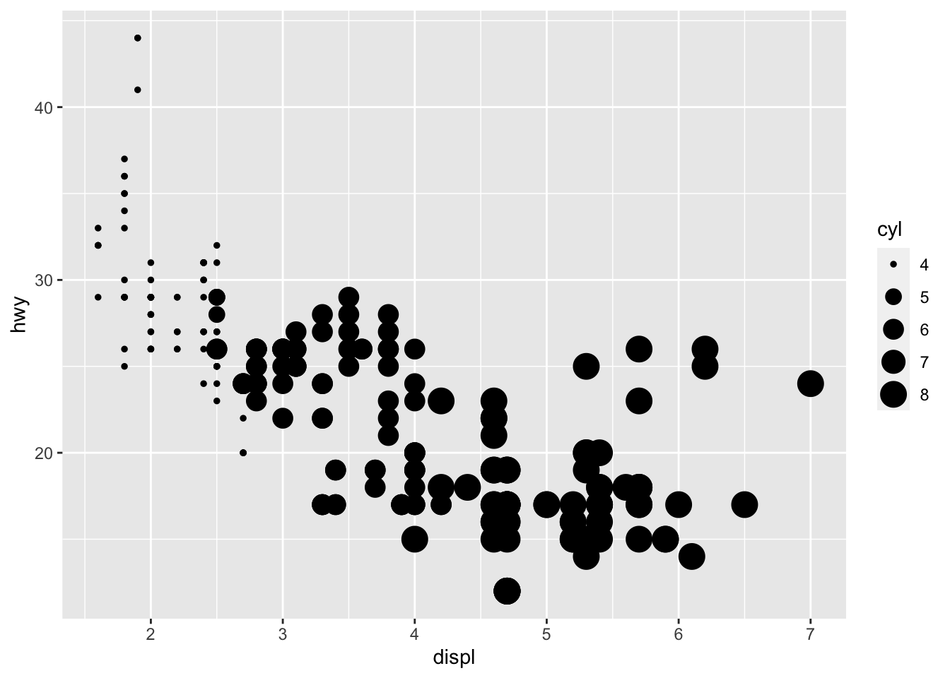
We could have mapped class to the alpha
aesthetic, which controls the transparency of the points
ggplot(data = mpg) +
    geom_point(mapping = aes(x = displ, y = hwy, size = cyl, alpha = class ))
## Warning: Using alpha for a discrete variable is not advised.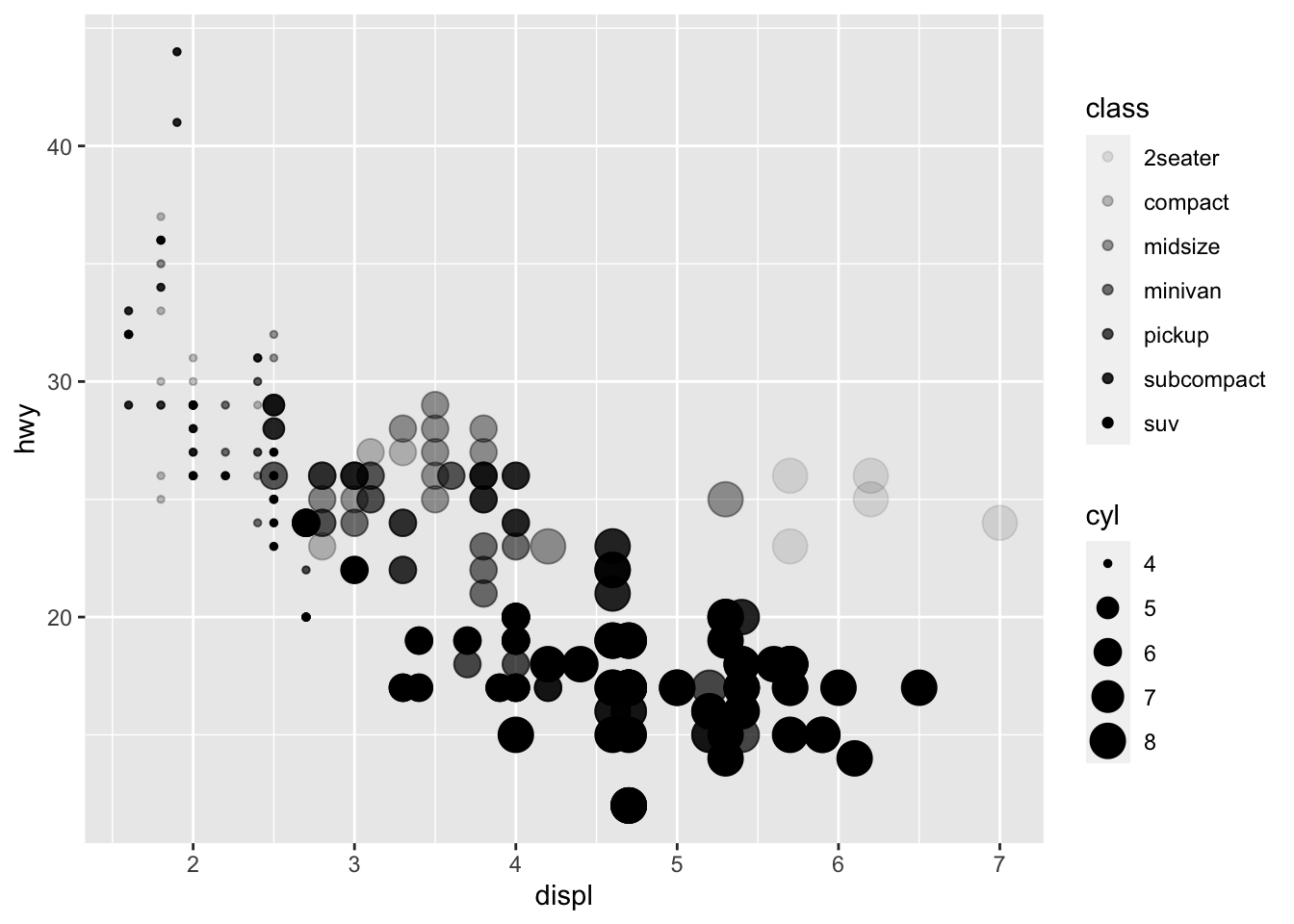
… or the shape of the points.
ggplot(data = mpg) +
  geom_point(mapping = aes(x = displ, y = hwy, shape = class))
## Warning: The shape palette can deal with a maximum of 6 discrete values because
## more than 6 becomes difficult to discriminate; you have 7. Consider
## specifying shapes manually if you must have them.## Warning: Removed 62 rows containing missing values (`geom_point()`).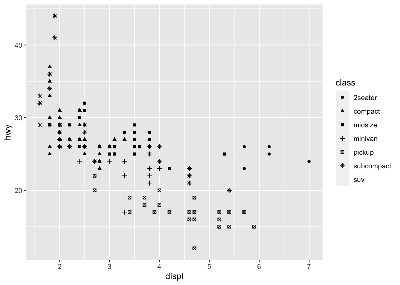
To set an aesthetic manually, set the aesthetic by name as an
argument of your geom function; i.e. it goes
outside of aes().
R has 25 built in shapes that are identified by numbers. There are some
seeming duplicates: for example, 0, 15, and 22 are all squares. The
difference comes from the interaction of the colour and
fill aesthetics. The hollow shapes (0–14) have a border
determined by colour; the solid shapes (15–18) are filled
with colour; the filled shapes (21–24) have a border of
colour and are filled with fill.
What’s gone wrong with this code? Why are the points not blue?
    ggplot(data = mpg) +
      geom_point(mapping = aes(x = displ, y = hwy, color = "blue"))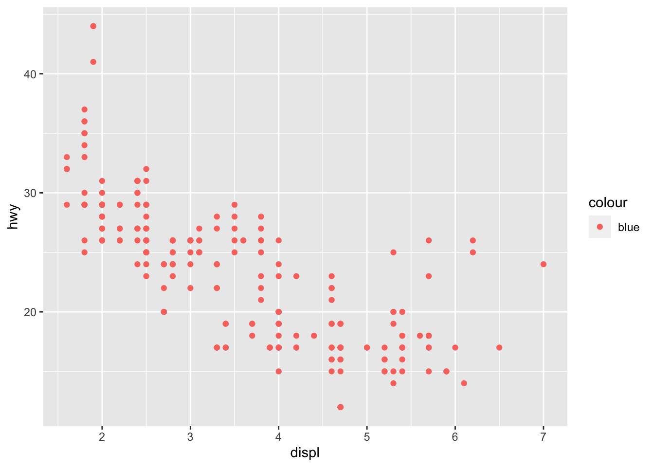
What has changed in the code below?
    ggplot(data = mpg) +
      geom_point(mapping = aes(x = displ, y = hwy), color = "blue")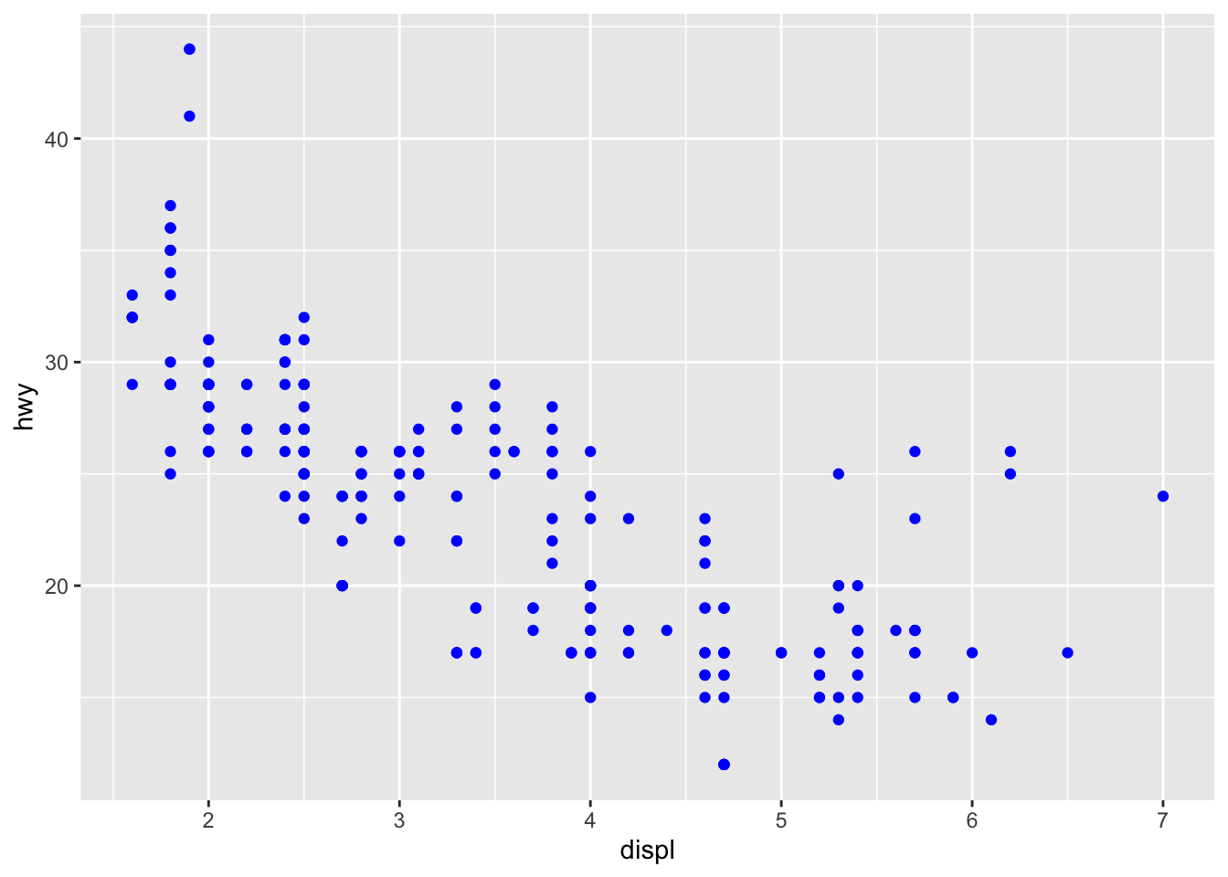
Facets
Particularly useful for categorical variables, is to split your plot into FACETS, subplots that each display one subset of the data.
- To facet your plot by a single variable, use
facet_wrap(). The first argument offacet_wrap()should be a formula.The variable that you pass tofacet_wrap()should be discrete.
ggplot(data = mpg) +
  geom_point(mapping = aes(x = displ, y = hwy)) +
  facet_wrap(~ class, nrow = 2)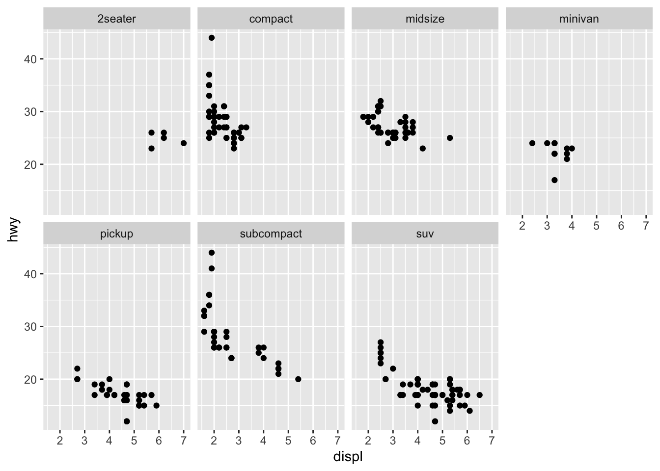
- To facet your plot on the combination of two variables, add
facet_grid()to your plot call.
ggplot(data = mpg) +
  geom_point(mapping = aes(x = displ, y = hwy)) +
  facet_grid(drv ~ cyl)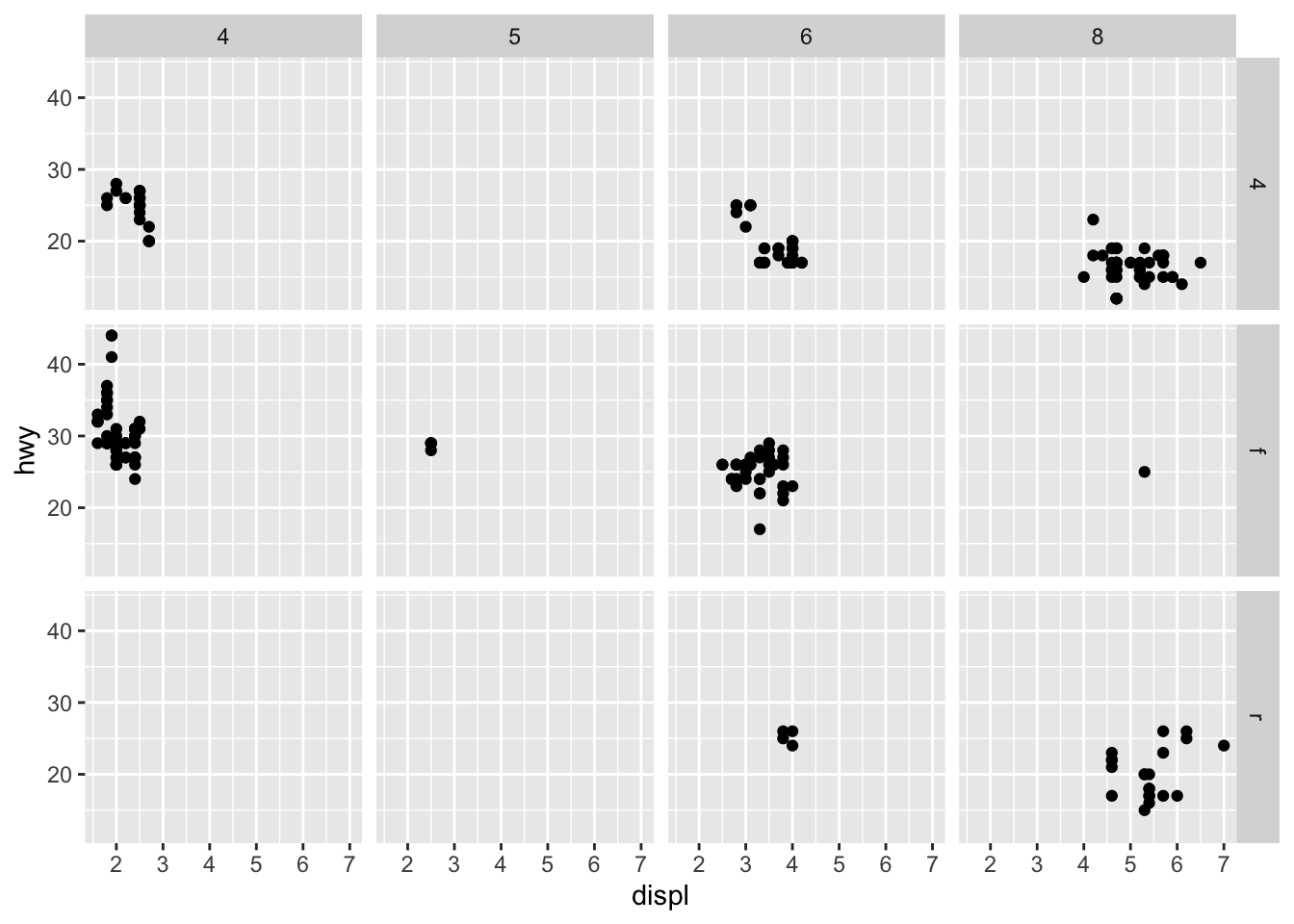
If you prefer to not facet in the rows or columns dimension, use a
. instead of a variable name,
e.g. + facet_grid(. ~ cyl).
Grid
It is useful to arange plots and save it to a pdf
p1 = ggplot(data = mpg, mapping = aes(x = displ, y = hwy)) +
  geom_point(mapping = aes(color = class))

p2 = ggplot(data = mpg, mapping = aes(x = displ, y = hwy)) +
  geom_line(mapping = aes(group = class))

library(gridExtra)
##
## Attaching package: 'gridExtra'## The following object is masked from 'package:dplyr':
##
## combinegrid.arrange(p1, p2, nrow=2)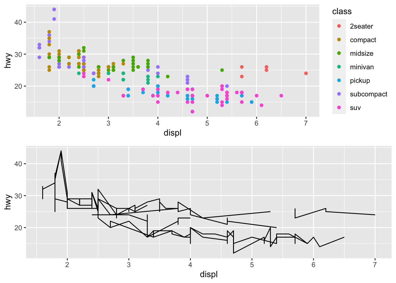
grid.arrange(p1, p2, nrow=1)
I can store plots as list of grobs
grobs = grid::gList()

grobs$POINTS = p1
grobs$LINES = p2

grid.arrange(grobs$POINTS, grobs$LINES, ncol=2)
Geometric objects
A geom is the geometrical object that a plot uses to represent data.
People often describe plots by the type of geom that the plot uses. For example, bar charts use bar geoms, line charts use line geoms, boxplots use boxplot geoms, and so on. Scatterplots break the trend; they use the point geom.
How are these two plots similar?

Each plot uses a different visual object to represent the data.
To change the geom in your plot, change the geom function that you
add to ggplot(). For instance, to make the plots above, you
can use this code:
# left plot
ggplot(data = mpg) +
  geom_point(mapping = aes(x = displ, y = hwy))

# right plot
ggplot(data = mpg) +
  geom_smooth(mapping = aes(x = displ, y = hwy))
Every geom function in ggplot2 takes a mapping
argument.
However, not every aesthetic works with every geom.
You could set the shape of a point, but you couldn’t set the “shape”
of a line. On the other hand, you could set the linetype of a
line. geom_smooth() will draw a different line, with a
different linetype, for each unique value of the variable that you map
to linetype.
ggplot(data = mpg) +
  geom_smooth(mapping = aes(x = displ, y = hwy, linetype = drv))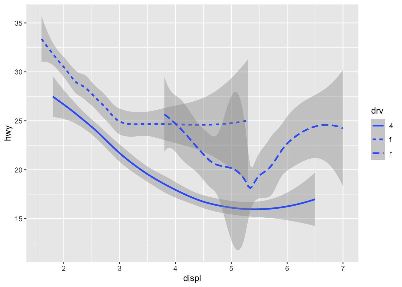
Here geom_smooth() separates the cars into three lines
based on their drv value, which describes a car’s
drivetrain. One line describes all of the points with a 4
value, one line describes all of the points with an f
value, and one line describes all of the points with an r
value. Here, 4 stands for four-wheel drive, f
for front-wheel drive, and r for rear-wheel drive.
If this sounds strange, we can make it more clear by overlaying the
lines on top of the raw data and then coloring everything according to
drv.
ggplot(data = mpg, mapping = aes(x = displ, y = hwy, color = drv)) +
  geom_point() +
  geom_smooth(mapping = aes(linetype = drv))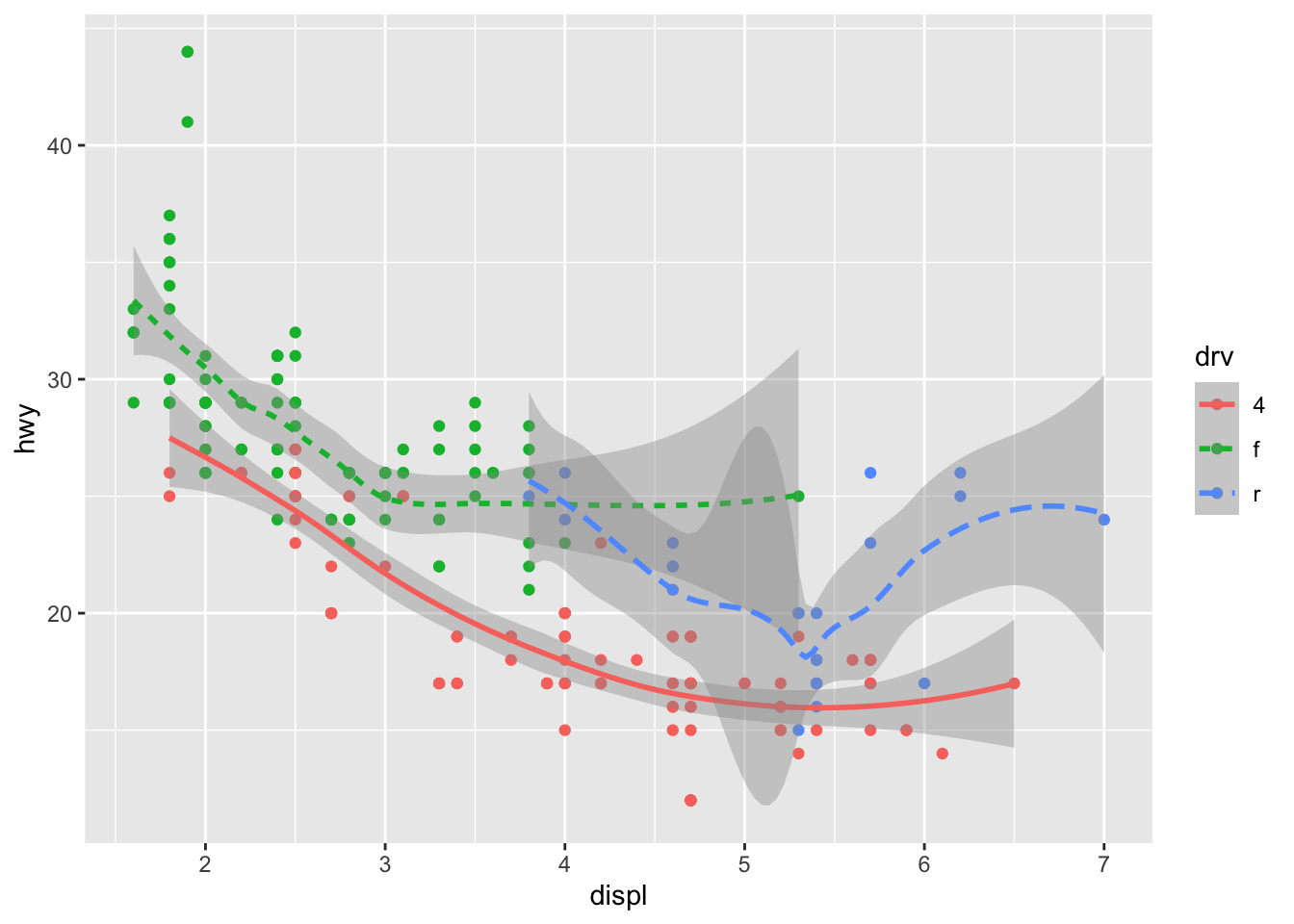
Many geoms, like geom_smooth(), use a single geometric
object to display multiple rows of data.
- For these geoms, you can set the
groupaesthetic to a categorical variable to draw multiple objects.
ggplot2 will draw a separate object for each unique value of the grouping variable.
- the group aesthetic by itself does not add a legend to the geoms.
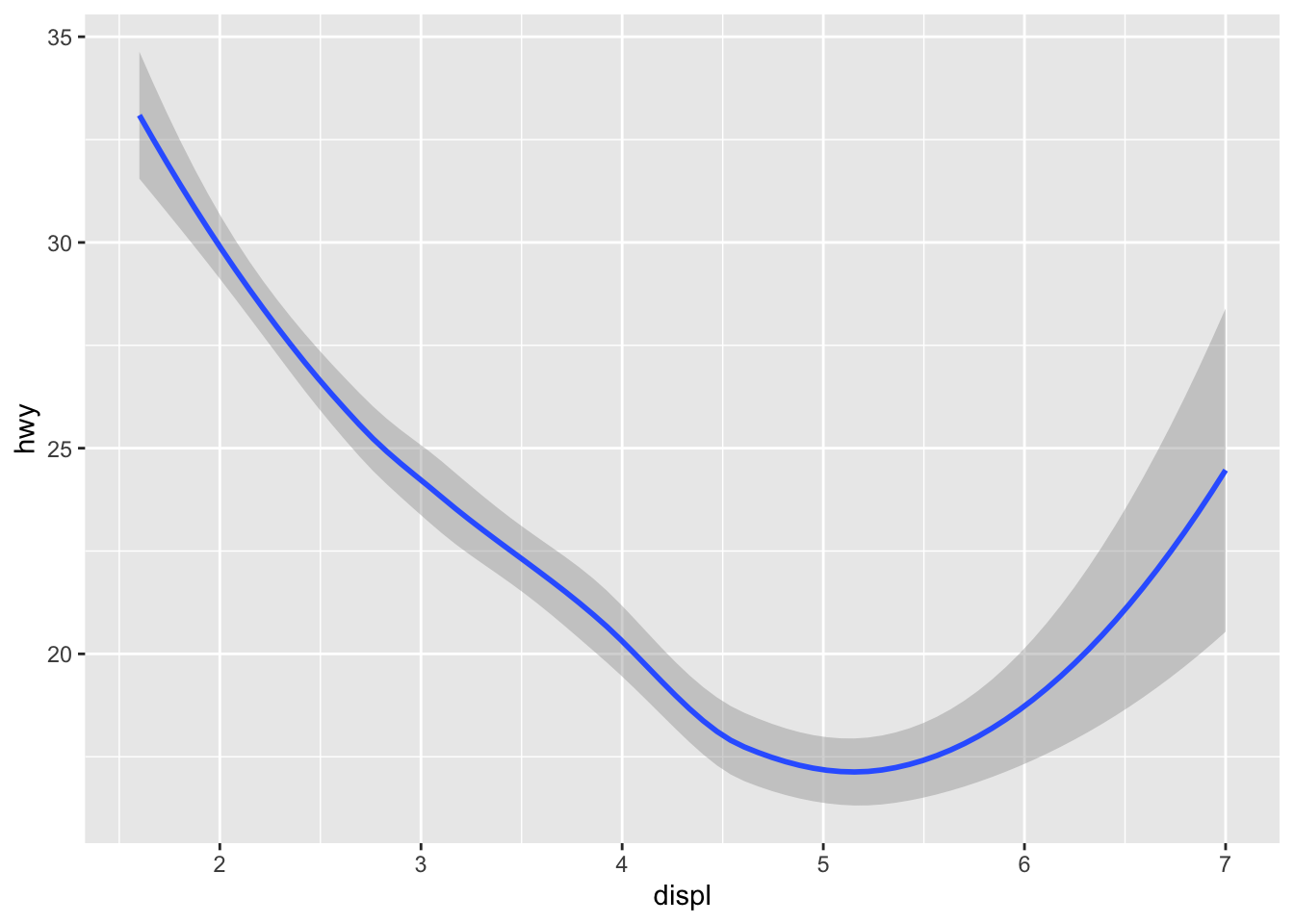
ggplot(data = mpg) +
  geom_smooth(mapping = aes(x = displ, y = hwy))
ggplot(data = mpg) +
  geom_smooth(mapping = aes(x = displ, y = hwy, group = drv))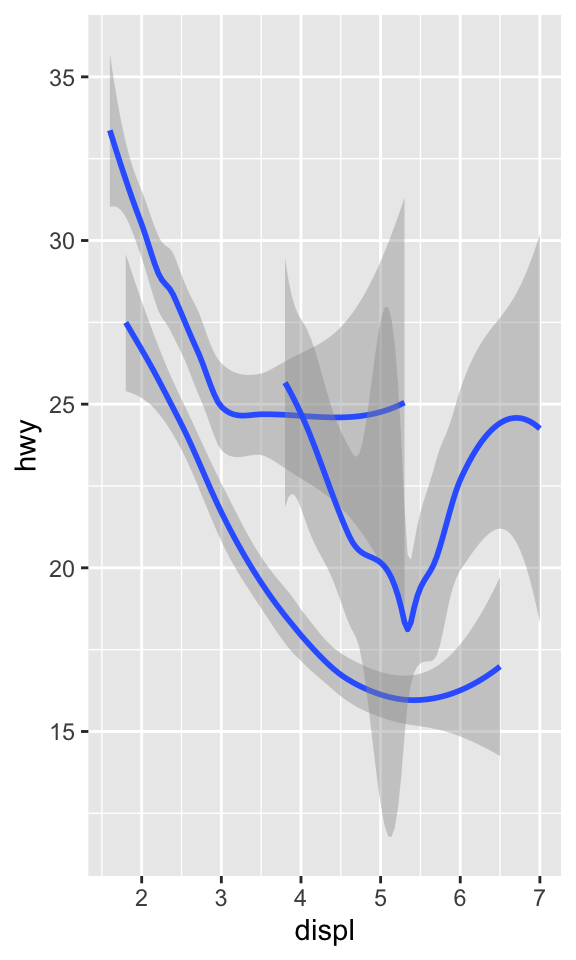
To display multiple geoms in the same plot, add multiple geom
functions to ggplot():
ggplot(data = mpg, mapping = aes(x = displ, y = hwy)) +
  geom_point(mapping = aes(color = class)) +
  geom_smooth()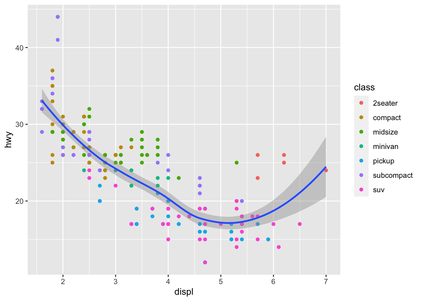
You can use the same idea to specify different data for
each layer.
ggplot(data = mpg, mapping = aes(x = displ, y = hwy)) +
  geom_point(mapping = aes(color = class)) +
  geom_smooth(data = filter(mpg, class == "subcompact"), se = FALSE)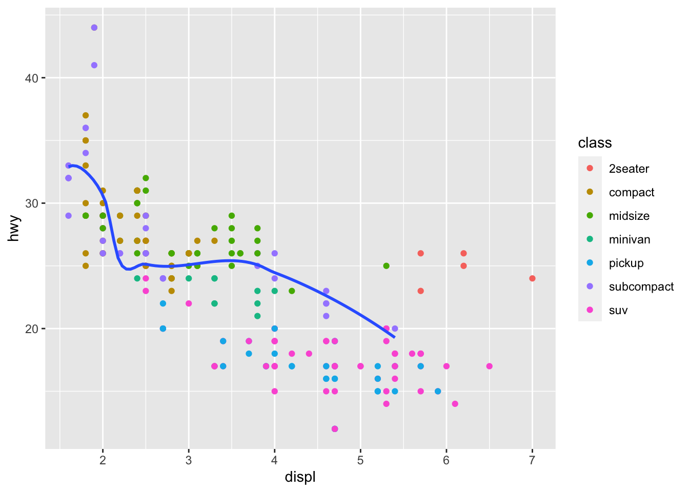
Statistical transformations
Let’s use diamonds, a data frame containing the prices and other attributes of almost 54,000 diamonds.
diamonds## # A tibble: 53,940 × 10
## carat cut color clarity depth table price x y z
## <dbl> <ord> <ord> <ord> <dbl> <dbl> <int> <dbl> <dbl> <dbl>
## 1 0.23 Ideal E SI2 61.5 55 326 3.95 3.98 2.43
## 2 0.21 Premium E SI1 59.8 61 326 3.89 3.84 2.31
## 3 0.23 Good E VS1 56.9 65 327 4.05 4.07 2.31
## 4 0.29 Premium I VS2 62.4 58 334 4.2 4.23 2.63
## 5 0.31 Good J SI2 63.3 58 335 4.34 4.35 2.75
## 6 0.24 Very Good J VVS2 62.8 57 336 3.94 3.96 2.48
## 7 0.24 Very Good I VVS1 62.3 57 336 3.95 3.98 2.47
## 8 0.26 Very Good H SI1 61.9 55 337 4.07 4.11 2.53
## 9 0.22 Fair E VS2 65.1 61 337 3.87 3.78 2.49
## 10 0.23 Very Good H VS1 59.4 61 338 4 4.05 2.39
## # … with 53,930 more rowstable(diamonds$cut)##
## Fair Good Very Good Premium Ideal
## 1610 4906 12082 13791 21551Consider a basic bar chart, as drawn with
geom_bar().
The following chart displays the total number of diamonds in the
diamonds dataset, grouped by cut.
ggplot(data = diamonds) +
  geom_bar(mapping = aes(x = cut))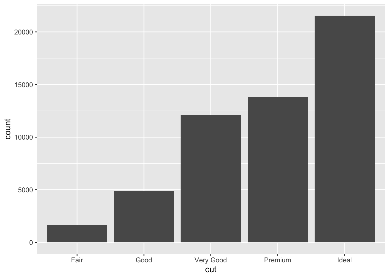
Other graphs, like bar charts, calculate new values to plot:
bar charts, histograms, and frequency polygons bin your data and then plot bin counts, the number of points that fall in each bin.
smoothers fit a model to your data and then plot predictions from the model.
boxplots compute a robust summary of the distribution and then display a specially formatted box.
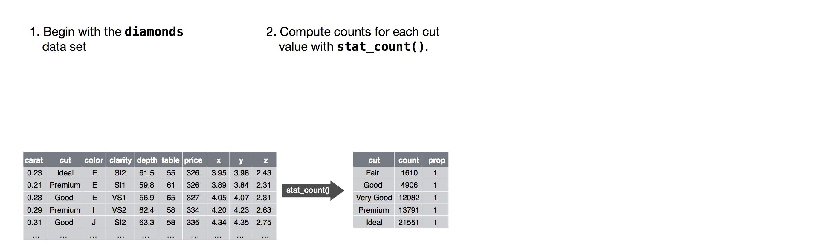
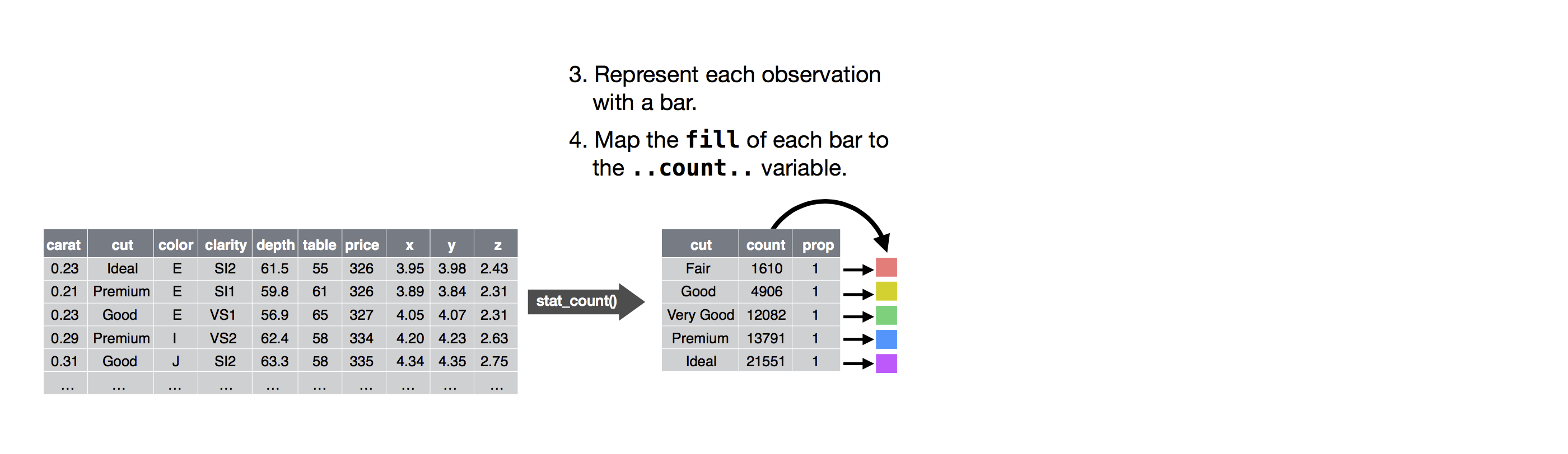
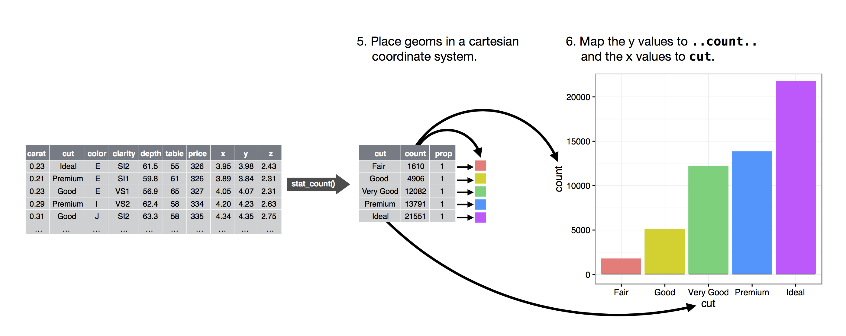
The algorithm used to calculate new values for a graph is called a stat, short for statistical transformation.
The figure below describes how this process works with
geom_bar().
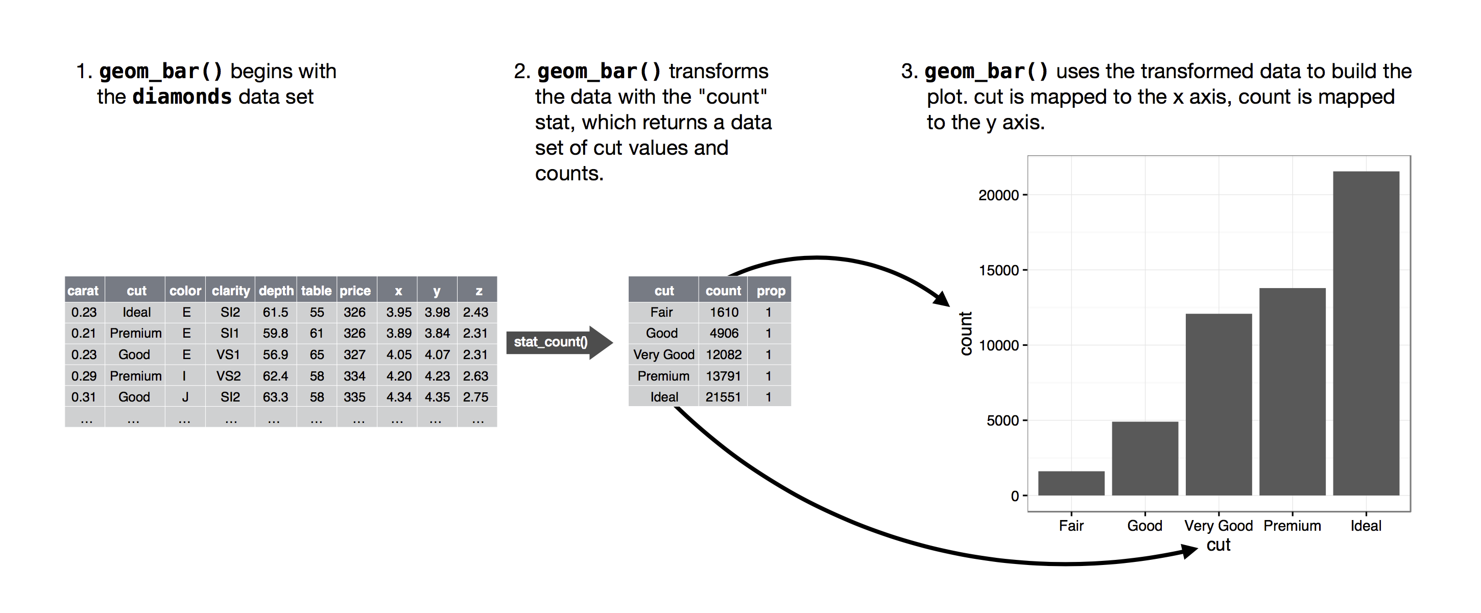
geom_bar() uses stat_count().
stat_count() computes two new variables:
count- and
prop.
You can generally use geoms and stats interchangeably.
For example, you can recreate the previous plot using
stat_count() instead of geom_bar():
ggplot(data = diamonds) +
  stat_count(mapping = aes(x = cut))
There are three reasons you might need to use a stat explicitly:
You might want to override the default stat. In the code below, I change the stat of
geom_bar()from count to identity. This lets me map the height of the bars to the raw values of a \(y\) variable. Unfortunately when people talk about bar charts casually, they might be referring to this type of bar chart, where the height of the bar is already present in the data, or the previous bar chart where the height of the bar is generated by counting rows.demo <- tribble( ~a, ~b, "bar_1", 20, "bar_2", 30, "bar_3", 40 ) ggplot(data = demo) + geom_bar(mapping = aes(x = a, y = b), stat = "identity")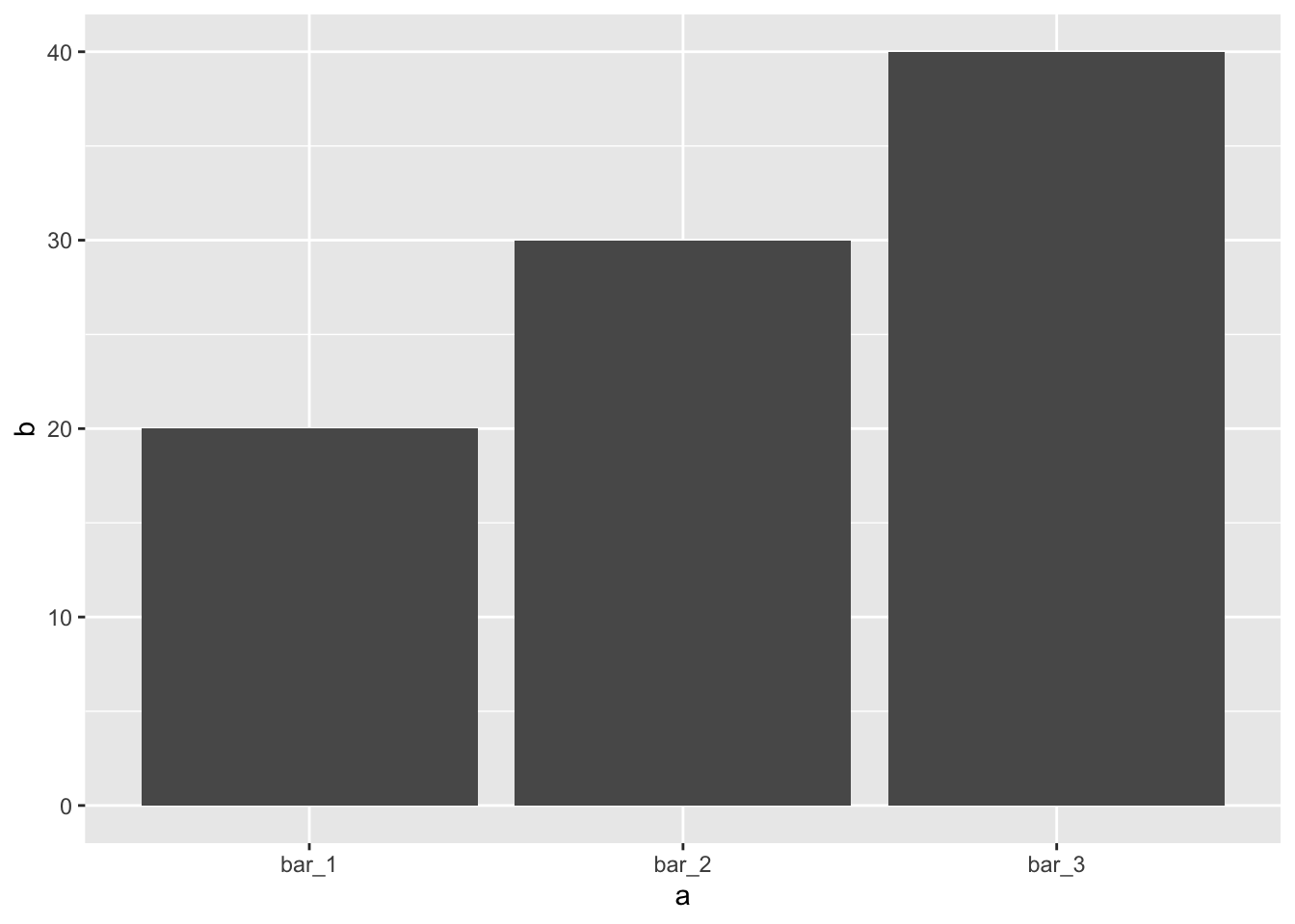
You might want to override the default mapping from transformed variables to aesthetics. For example, you might want to display a bar chart of proportion, rather than count:
ggplot(data = diamonds) +
  geom_bar(mapping = aes(x = cut, y = ..prop.., group = 1))
## Warning: The dot-dot notation (`..prop..`) was deprecated in ggplot2 3.4.0. ## ℹ Please use `after_stat(prop)` instead.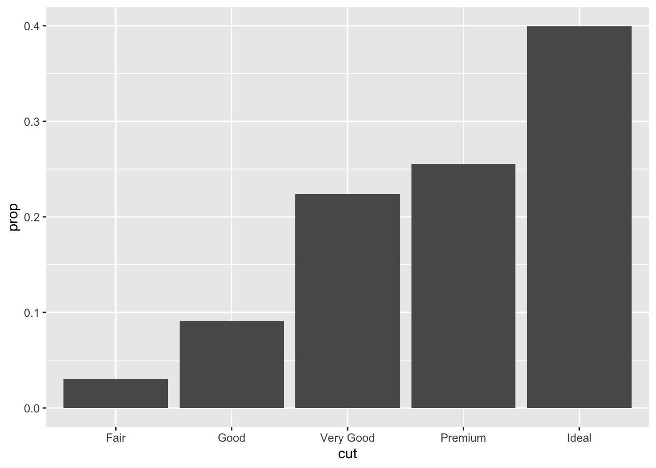
You might want to draw greater attention to the statistical transformation in your code. For example, you might use
stat_summary(), which summarises the y values for each unique x value, to draw attention to the summary that you’re computing:ggplot(data = diamonds) + stat_summary( mapping = aes(x = cut, y = depth), fun.min = min, fun.max = max, fun = median )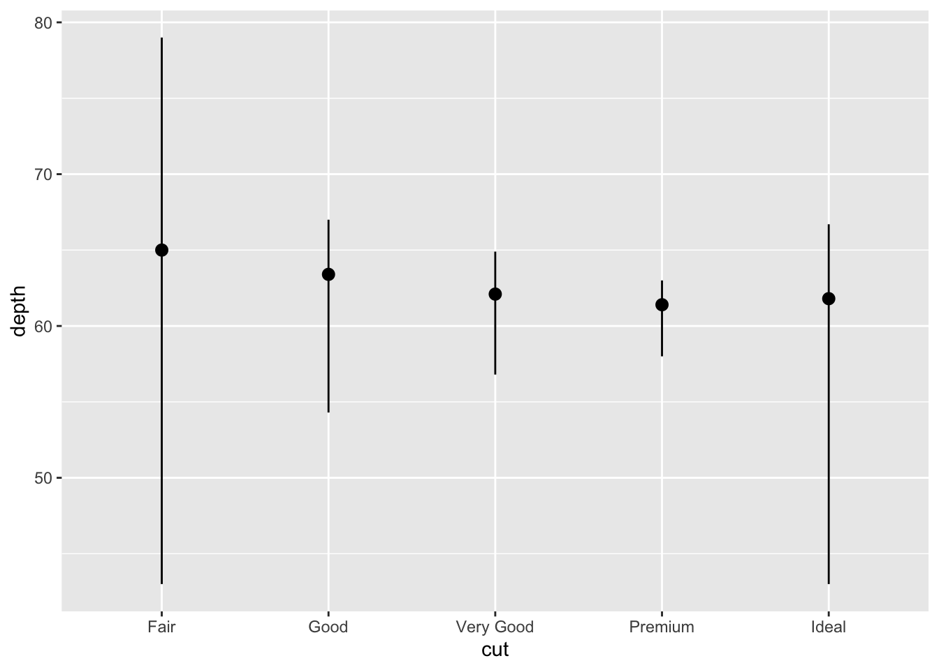
ggplot2 provides over 20 stats for you to use. Each
stat is a function, so you can get help in usual way,
e.g. ?stat_bin.
Position adjustments
You can colour a bar chart using either the colour
aesthetic, or more usefully, fill:
ggplot(data = diamonds) +
  geom_bar(mapping = aes(x = cut, colour = cut))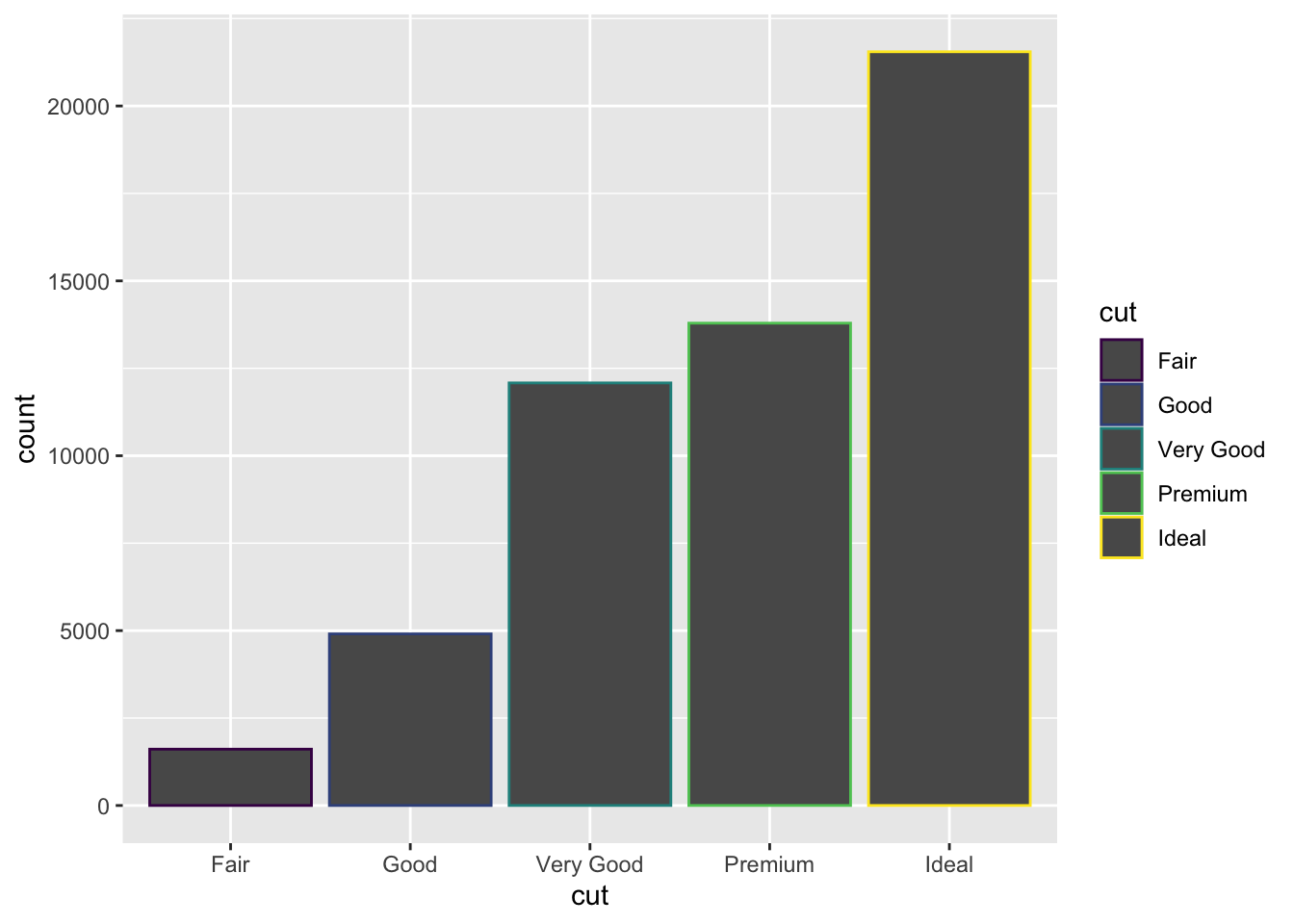
ggplot(data = diamonds) +
  geom_bar(mapping = aes(x = cut, fill = cut))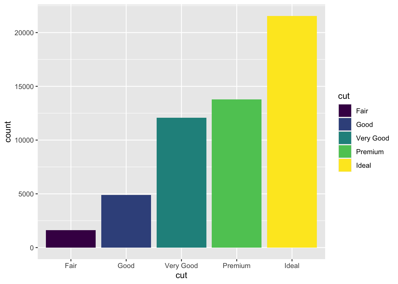
Note what happens if you map the fill aesthetic to another variable,
like clarity: the bars are automatically stacked. Each
colored rectangle represents a combination of cut and
clarity.
ggplot(data = diamonds) +
  geom_bar(mapping = aes(x = cut, fill = clarity))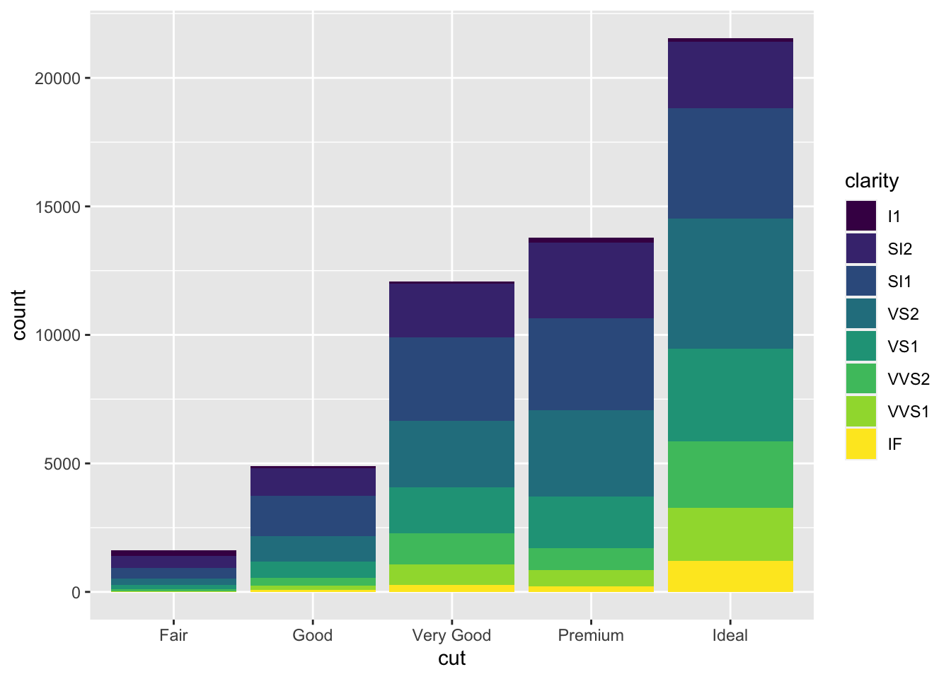
The stacking is performed automatically by the position adjustment specified by the
positionargument.
If you don’t want a stacked bar chart, you can use one of three other
options: "identity", "dodge" or
"fill".
position = "identity"will place each object exactly where it falls in the context of the graph. To see that overlapping we either need to make the bars slightly transparent by settingalphato a small value, or completely transparent by settingfill = NA.ggplot(data = diamonds, mapping = aes(x = cut, fill = clarity)) + geom_bar(alpha = 1/5, position = "identity")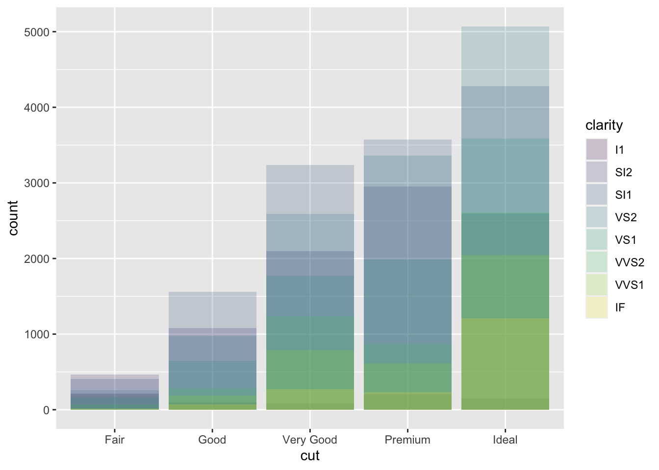
ggplot(data = diamonds, mapping = aes(x = cut, colour = clarity)) +
  geom_bar(fill = NA, position = "identity")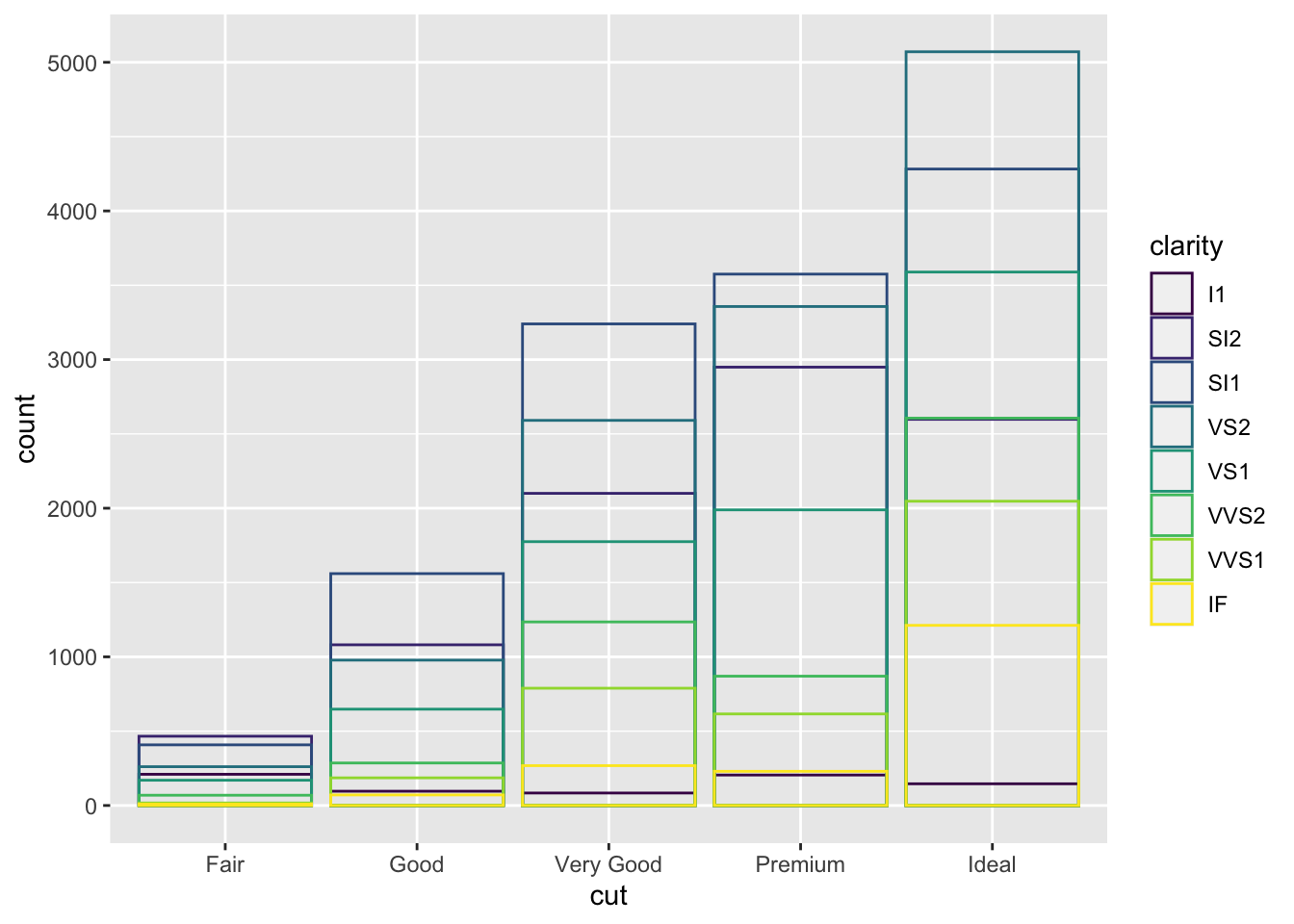
The identity position adjustment is more useful for 2d geoms, like points, where it is the default.
position = "fill"works like stacking, but makes each set of stacked bars the same height. This makes it easier to compare proportions across groups.ggplot(data = diamonds) + geom_bar(mapping = aes(x = cut, fill = clarity), position = "fill")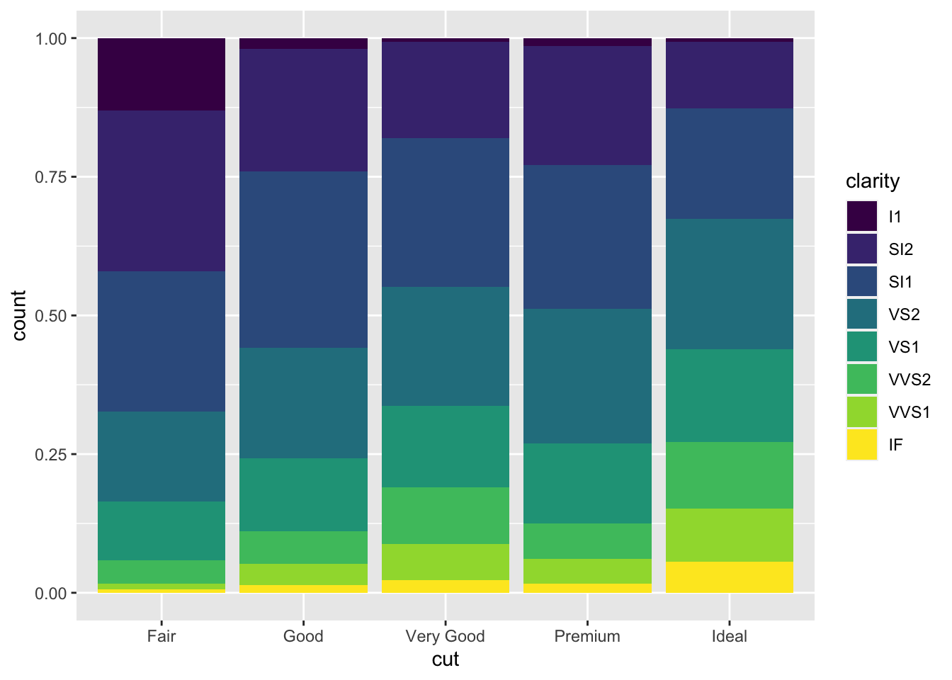
position = "dodge"places overlapping objects directly beside one another. This makes it easier to compare individual values.ggplot(data = diamonds) + geom_bar(mapping = aes(x = cut, fill = clarity), position = "dodge")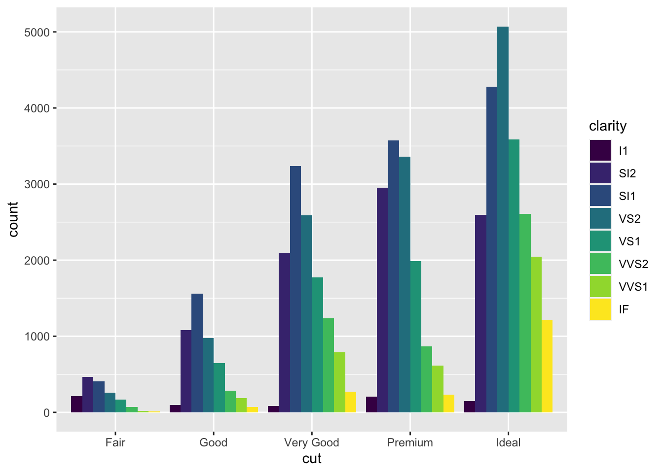
Overplotting
Recall our first scatterplot. Did you notice that the plot displays only 126 points, even though there are 234 observations in the dataset?

The values of hwy and displ are rounded so
the points appear on a grid and many points overlap each other.
This problem is known as overplotting.
You can avoid this gridding by setting the position adjustment to
“jitter”. position = "jitter" adds a small amount of random
noise to each point. This spreads the points out because no two points
are likely to receive the same amount of random noise.
ggplot(data = mpg) +
  geom_point(mapping = aes(x = displ, y = hwy), position = "jitter")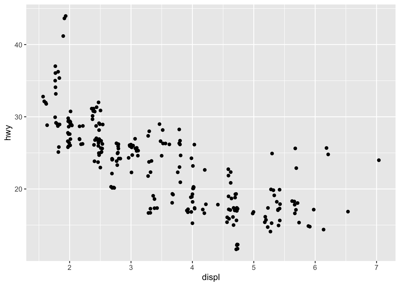
Adding randomness seems like a strange way to improve your plot, but
while it makes your graph less accurate at small scales, it makes your
graph more revealing at large scales. Because this is
such a useful operation, ggplot2 comes with a shorthand for
geom_point(position = "jitter"):
geom_jitter().
To learn more about a position adjustment, look up the help page
associated with each adjustment: ?position_dodge,
?position_fill, ?position_identity,
?position_jitter, and ?position_stack.
Coordinate systems
The default coordinate system is the Cartesian coordinate system. There are a number of other coordinate systems that are occasionally helpful.
coord_flip()switches the x and y axes. This is useful (for example), if you want horizontal boxplots. It’s also useful for long labels: it’s hard to get them to fit without overlapping on the x-axis.ggplot(data = mpg, mapping = aes(x = class, y = hwy)) + geom_boxplot()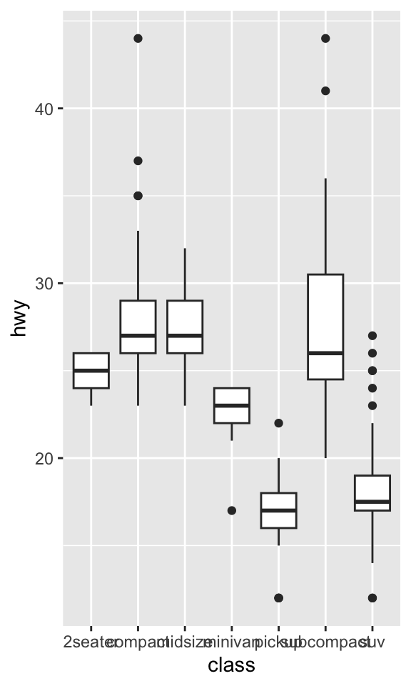
ggplot(data = mpg, mapping = aes(x = class, y = hwy)) + geom_boxplot() + coord_flip()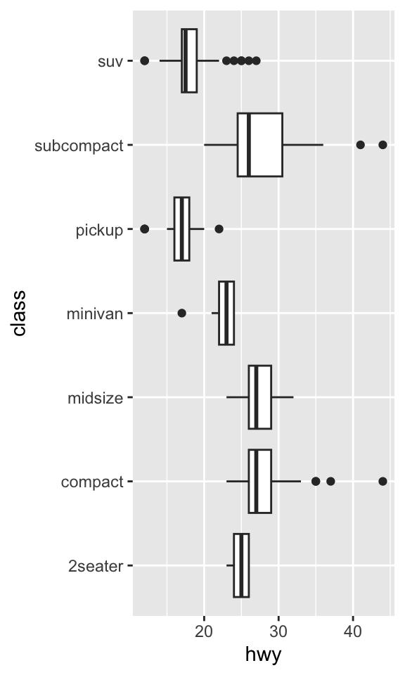
coord_quickmap()sets the aspect ratio correctly for maps. This is very important if you’re plotting spatial data with ggplot2 (which unfortunately we don’t have the space to cover in this lectures).nz <- map_data("italy") ggplot(nz, aes(long, lat, group = group)) + geom_polygon(fill = "white", colour = "black")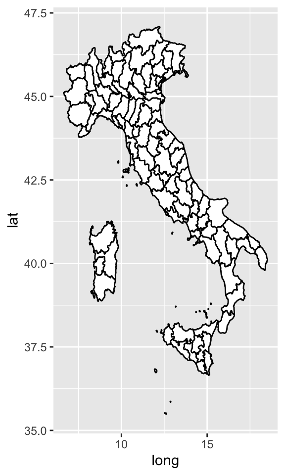
ggplot(nz, aes(long, lat, group = group)) +
  geom_polygon(fill = "white", colour = "black") +
  coord_quickmap()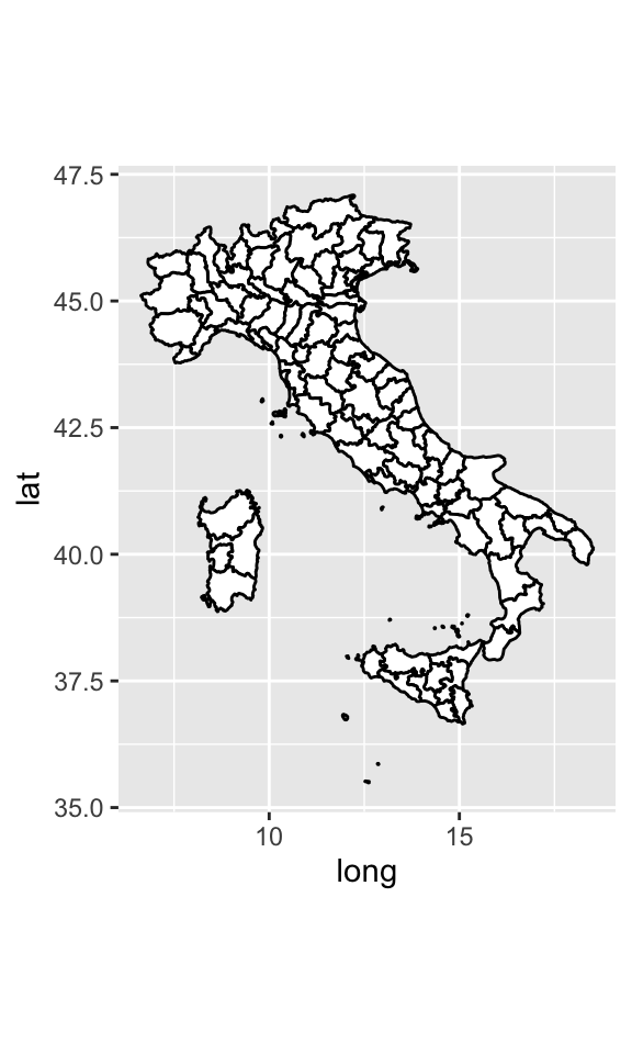
ggplot(nz, aes(long, lat, group = group)) +
geom_polygon(fill = "green", colour = "black") +
coord_quickmap() + theme_void()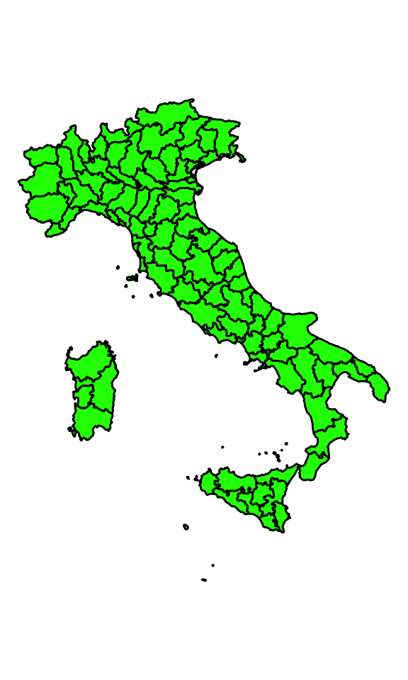
Talking about maps… Leaflet is one of the most popular open-source JavaScript libraries for interactive maps. It’s used by websites ranging from The New York Times and The Washington Post to GitHub and Flickr, as well as GIS specialists like OpenStreetMap, Mapbox, and CartoDB.
This R package makes it easy to integrate and control Leaflet maps in R.
library(leaflet)

m <- leaflet() %>%
  addTiles() %>%  # Add default OpenStreetMap map tiles
  addMarkers(lng=174.768, lat=-36.852, popup="The birthplace of R")
m # Print the mapcoord_polar()uses polar coordinates. Polar coordinates reveal an interesting connection between a bar chart and a Coxcomb chart.bar <- ggplot(data = diamonds) + geom_bar( mapping = aes(x = cut, fill = cut), show.legend = FALSE, width = 1 ) + theme(aspect.ratio = 1) + labs(x = NULL, y = NULL) bar + coord_flip()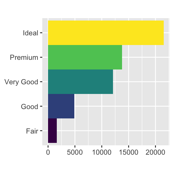
bar + coord_polar()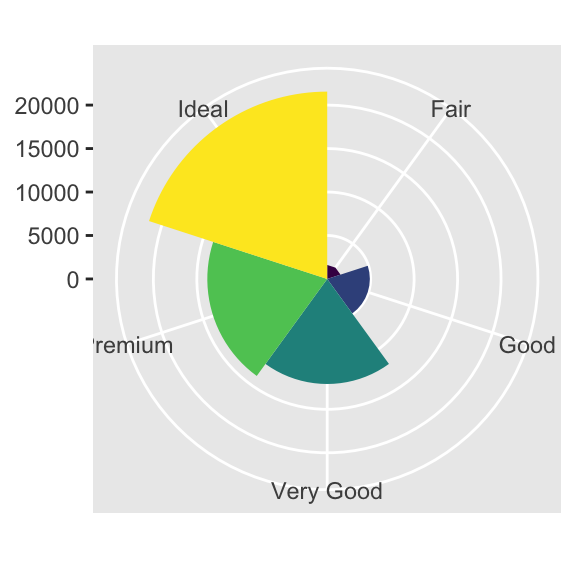
The layered grammar of graphics
ggplot(data = DATA) + GEOM_FUNCTION( mapping = aes(MAPPINGS), stat = STAT, position = POSITION ) + COORDINATE_FUNCTION + FACET_FUNCTION
To see how this works, consider how you could build a basic plot from scratch: you could start with a dataset and then transform it into the information that you want to display (with a stat).
Alluvial diagrams
Alluvial diagrams are a subset of Sankey diagrams, where the width of the line between two nodes is proportional to the flow amount. , and are more rigidly defined. The ggalluvial package is a ggplot2 extension for producing alluvial plots in a tidyverse framework. The design and functionality were originally inspired by the alluvial package.
# create alluvial diagram
library(ggplot2)
library(ggalluvial)

titanic_wide <- data.frame(Titanic)
head(titanic_wide)
## Class Sex Age Survived Freq
## 1 1st Male Child No 0
## 2 2nd Male Child No 0
## 3 3rd Male Child No 35
## 4 Crew Male Child No 0
## 5 1st Female Child No 0
## 6 2nd Female Child No 0ggplot(data = titanic_wide,
aes(axis1 = Class, axis2 = Sex, axis3 = Age,
y = Freq)) +
scale_x_discrete(limits = c("Class", "Sex", "Age"), expand = c(.2, .05)) +
xlab("Demographic") +
geom_alluvium(aes(fill = Survived)) +
geom_stratum() +
geom_text(stat = "stratum", aes(label = after_stat(stratum))) +
theme_minimal() +
ggtitle("passengers on the maiden voyage of the Titanic",
"stratified by demographics and survival")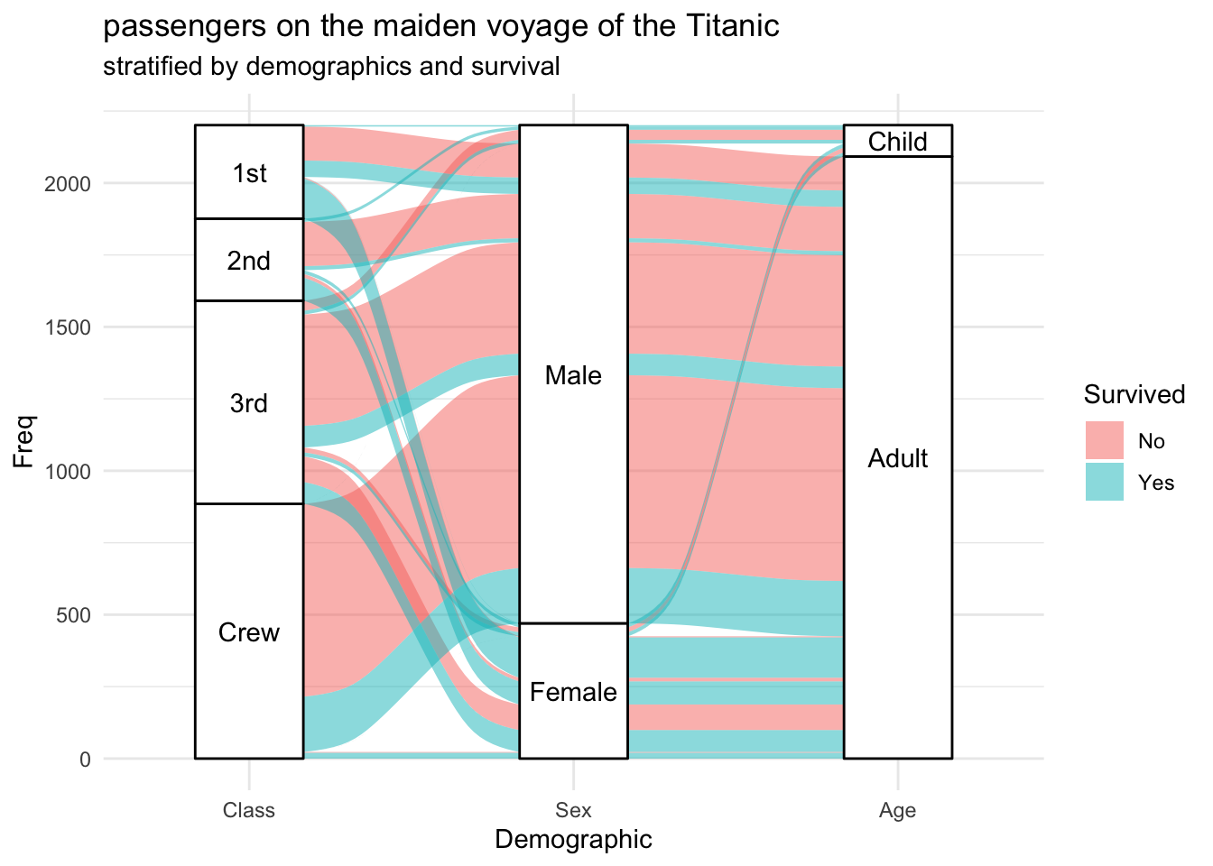
Depicting Clonal Evolution: the fishplot package
library(fishplot)## Using fishPlot version 0.5.1timepoints=c(0,30,75,150)
#provide a matrix with the fraction of each population
#present at each timepoint
frac.table = matrix(
c(100, 45, 00, 00,
02, 00, 00, 00,
02, 00, 02, 01,
98, 00, 95, 40),
ncol=length(timepoints))
#provide a vector listing each clone's parent
#(0 indicates no parent)
parents = c(0,1,1,3)
#create a fish object
fish = createFishObject(frac.table,parents,timepoints=timepoints)
#calculate the layout of the drawing
fish = layoutClones(fish)
#draw the plot, using the splining method (recommended)
#and providing both timepoints to label and a plot title
fishPlot(fish,shape="spline",title.btm="CRC_S1",
cex.title=0.5, vlines=c(0,150),
vlab=c("First Surgery","Reharsal"))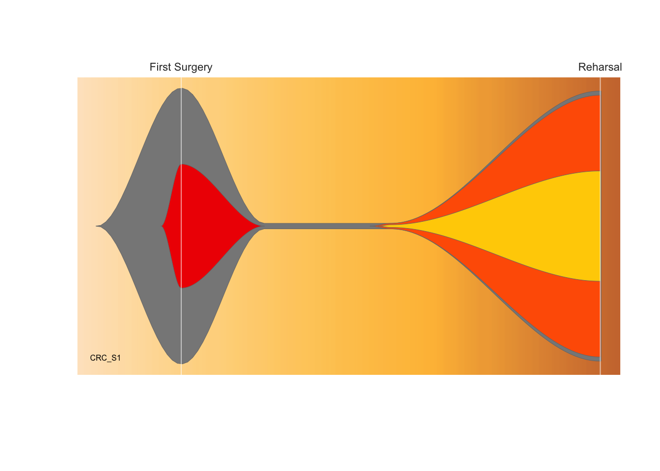
Generative art with R
Generative art (An automated process that takes garbage as input and creates unpredictably delightful outputs)
Fractals
wallpaper<-function(n=4E4,x0=1,y0=1,a=1,b=4,c=60){
    x<-c(x0,rep(NA,n-1))
    y<-c(y0,rep(NA,n-1))
    cor<-rep(0,n)
    for (i in 2:n){

        x[i] = y[i-1] - sign(x[i-1])*sqrt(abs( b*x[i-1] - c) )
        y[i] = a - x[i-1]
        cor[i]<-round(sqrt((x[i]-x[i-1])^2+(y[i]-y[i-1])^2),0)
    }
    n.c<-length(unique(cor))
    cores<-rainbow(n.c)

    par(bg = "black")
    plot(x,y,pch=".",col=cores[cor])

}

wallpaper()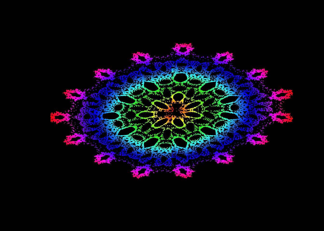
set.seed(123)
n <- 50
dat <- tibble(
  x0 = runif(n),
  y0 = runif(n),
  x1 = x0 + runif(n, min = -.2, max = .2),
  y1 = y0 + runif(n, min = -.2, max = .2),
  shade = runif(n),
  size = runif(n)
)
dat
## # A tibble: 50 × 6
## x0 y0 x1 y1 shade size
## <dbl> <dbl> <dbl> <dbl> <dbl> <dbl>
## 1 0.288 0.0458 0.328 0.185 0.239 0.257
## 2 0.788 0.442 0.721 0.441 0.962 0.222
## 3 0.409 0.799 0.404 0.754 0.601 0.593
## 4 0.883 0.122 1.06 0.0205 0.515 0.268
## 5 0.940 0.561 0.934 0.405 0.403 0.531
## 6 0.0456 0.207 0.202 0.163 0.880 0.785
## 7 0.528 0.128 0.694 0.156 0.364 0.168
## 8 0.892 0.753 0.936 0.640 0.288 0.404
## 9 0.551 0.895 0.516 0.873 0.171 0.472
## 10 0.457 0.374 0.315 0.262 0.172 0.868
## # … with 40 more rowsdat |>
ggplot(aes(
x = x0,
y = y0,
xend = x1,
yend = y1,
colour = shade,
linewidth = size
)) +
geom_segment(show.legend = FALSE) +
coord_polar() +
scale_y_continuous(expand = c(0, 0)) +
scale_x_continuous(expand = c(0, 0)) +
scale_color_viridis_c() +
scale_size(range = c(0, 10)) +
theme_void()
Generative art
 library(jasmines)


use_seed(1) %>%
  entity_circle(grain = 1000, size = 2) %>%
  unfold_warp(iterations = 100) %>%
  style_ribbon(palette = "rainbow")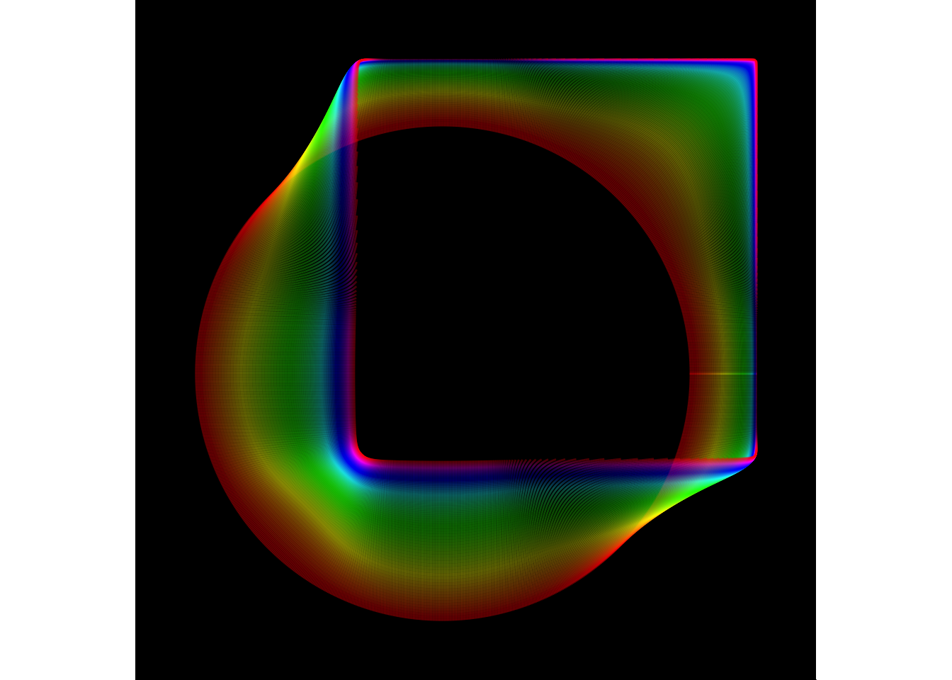
The use_seed() function is a convenience function that sets the random number generator seed, and stores that value for later use. The seed is then piped to an entity_ function (or a scene_ function) that creates the initial object that will be operated upon. In this case this initial object is a circle of diameter 2 rendered using 1000 points. This is then passed to an unfold_ function, that iteratively applies some operation (in this case the “warp”) operation for some number of steps (in this case 100). The object is converted to a ggplot2 image using one of the style_ functions. In this and most cases the style_ribbon() is used and has several customisable finctions.
use_seed(1) %>%
  scene_discs(
    rings = 3, points = 5000, size = 5
  ) %>%
  mutate(ind = 1:n()) %>%
  unfold_warp(
    iterations = 1,
    scale = .5,
    output = "layer"
  ) %>%
  unfold_tempest(
    iterations = 20,
    scale = .01
  ) %>%
  style_ribbon(
    palette = palette_named("vik"),
    colour = "ind",
    alpha = c(.1,.1),
    #background = "oldlace"
    background = "black"
  )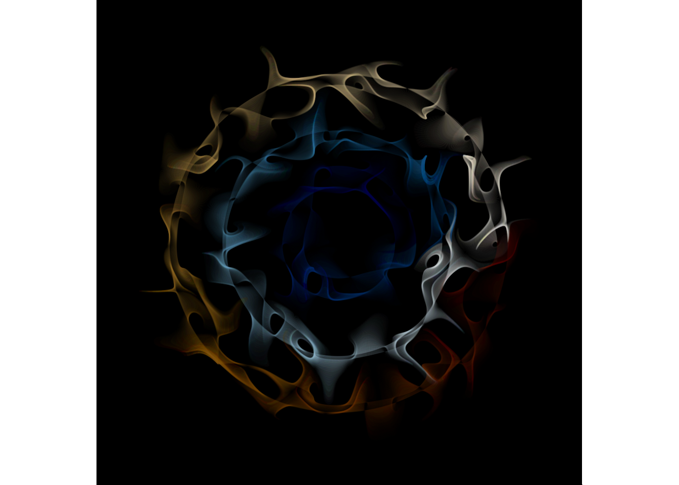
A work by Matteo Cereda and Fabio Iannelli