Complex Heatmap
Introduction
If you’d like to learn more about the theoretical underpinnings of complexHeatmap before you start,
visit the BioConductor package page https://bioconductor.org/packages/release/bioc/html/ComplexHeatmap.html.
The Idea
Complex heatmaps are efficient to visualize associations between different sources of data sets and reveal potential patterns.
The ComplexHeatmap package provides a highly flexible way to arrange multiple heatmaps and supports various annotation graphics.
The ComplexHeatmap package is inspired by the pheatmap package.
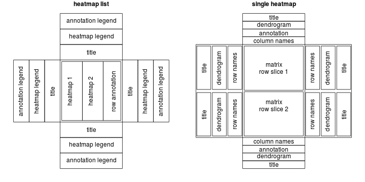
To describe a heatmap list, there are following classes:
HEATMAP class: a single heatmap containing heatmap body, row/column names, titles, dendrograms and column annotations.
HeatmapLIST class: a list of heatmaps and row annotations.
HeatmapANNOTATION class: defines a list of row annotations and column annotations.
There are also several internal classes:
SingleAnnotation class: defines a single row annotation or column annotation.
ColorMapping class: mapping from values to colors.
ComplexHeatmap is implemented under grid system, so
users should know basic grid functionality to get full use of the
package.
Required libraries
library("ComplexHeatmap")
library("circlize")
library("tidyverse")
Making a Single Heatmap
Let’s consider a single cell RNA-Seq data for mouse T-cells is visualized to show the heterogeneity of cells.
expr = readRDS(paste0(system.file(package = "ComplexHeatmap"), "/extdata/gene_expression.rds"))

set.seed(123)

mat = expr[ 1:10, 1:10]

as_tibble(mat)
## # A tibble: 10 × 10
## s1_cell01 s2_cell02 s3_cell03 s4_ce…¹ s5_ce…² s6_ce…³ s7_ce…⁴ s8_ce…⁵ s9_ce…⁶
## <dbl> <dbl> <dbl> <dbl> <dbl> <dbl> <dbl> <dbl> <dbl>
## 1 11.1 12.7 11.4 10.8 12.3 11.1 11.1 12.8 11.2
## 2 10.9 8.56 11.4 10.2 8.86 10.7 9.60 7.96 10.5
## 3 9.45 8.04 8.94 10.5 8.40 8.01 9.44 7.04 8.46
## 4 12.6 11.8 11.5 13.9 10.6 11.1 13.5 11.2 11.8
## 5 13.4 11.3 14.0 12.1 12.5 13.0 12.1 11.0 13.3
## 6 10.0 7.26 10.3 9.91 8.22 10.7 11.3 8.49 10.7
## 7 14.1 12.6 12.9 14.5 14.3 12.5 15.0 13.5 13.4
## 8 12.0 15.5 12.8 12.5 17.4 13.5 11.3 15.0 12.3
## 9 12.4 11.7 12.8 13.1 11.7 12.8 12.2 11.5 13.8
## 10 10.4 10.2 11.6 10.8 9.47 12.2 11.6 9.78 11.9
## # … with 1 more variable: s10_cell01 <dbl>, and abbreviated variable names
## # ¹s4_cell01, ²s5_cell02, ³s6_cell03, ⁴s7_cell01, ⁵s8_cell02, ⁶s9_cell03mat=as.matrix(mat)
Heatmap(mat)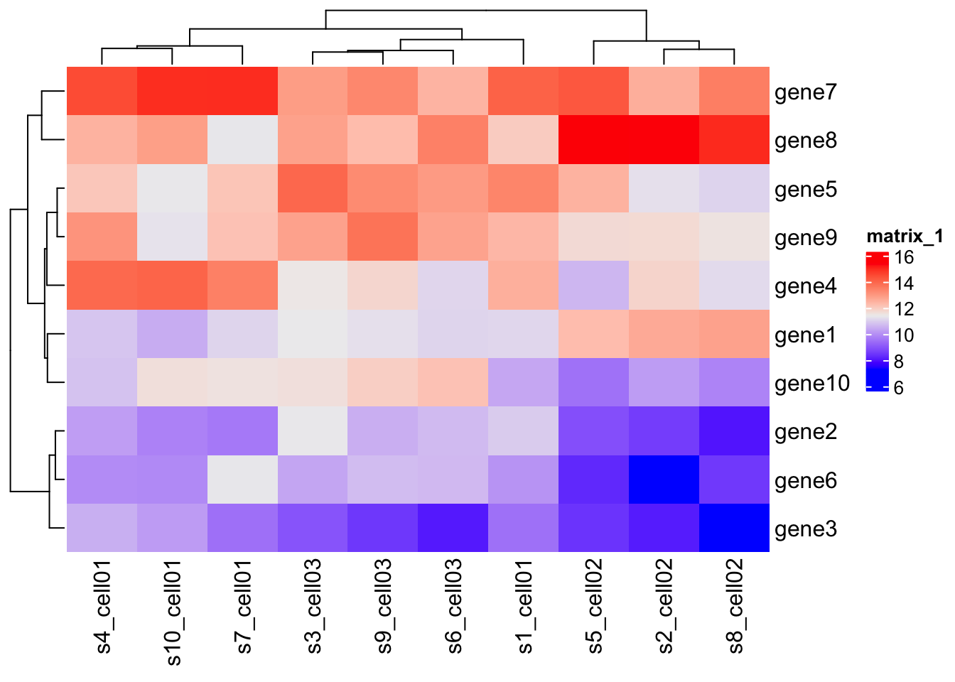
There are several parameters that you can tune. The most used are:
col= set the color scale. In most cases, the heatmap visualizes a matrix with continuous values. In this case, user should provide a color mapping function, ascolorRamp2()from the circlize package. If the matrix contains discrete values (either numeric or character), colors should be specified as a named vector to make it possible for the mapping from discrete values to colors. If there is no name for the color, the order of colors corresponds to the order ofunique(mat).na_col= control NA value color. The matrix which contains NA can also be clustered by Heatmap() (since dist() accepts NA values) and clustering a matrix with NA values by “pearson”, “spearman” or “kendall” method gives warning messages.name= Name of the heatmap.heatmap_legend_param= legend parameters. You can control parameters of the legend passing a list of named agument to this parameter.row_title,column_title= list of parameters of row/column titlesrow_title_gp,column_title_gp= list of parameters of row/column titlescluster_rows,cluster_rows= TRUE/FALSE clustering of rows and columns.show_row_dend,show_column_dend= TRUE/FALSE to show row/column dendrogram.clustering_distance_rows= You can specify the clustering either by a pre-defined method (e.g. “eulidean” or “pearson”), or by a distance function, or by a object that already contains clustering, or directly by a clustering function.split= split row by group.
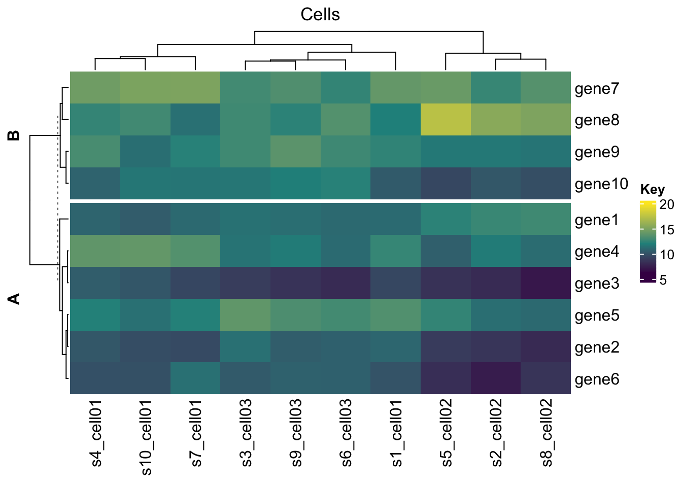
Heatmap(mat,
        name = "SEMM",
        col  = colorRamp2(c(6, 12, 20), viridis::viridis(3)),
        na_col = "black",
        heatmap_legend_param = list(title = "Key"),
        column_title = "Cells",
        row_title_gp = gpar(fontface = "bold"),
        clustering_distance_rows = 'pearson',
        cluster_rows = T,
        cluster_columns = T,
        split = c(rep("A", 6),rep("B", 4) )
)
Cell function
A paramater that controls what is plotted in each cell is
cell_fun
cell_fun = self-defined function to add graphics on each
cell.
Seven parameters will be passed into this function.
| Parameters | Meaning |
|---|---|
i |
row index in matrix |
j |
column index in matrix |
x |
x-coordinate of the middle points in the heatmap body viewport |
y |
y-coordinate of the middle points in the heatmap body viewport |
width |
width of the cell |
height |
height of the cell |
fill |
the filled color. |
x, y, width and height are all unit objects.
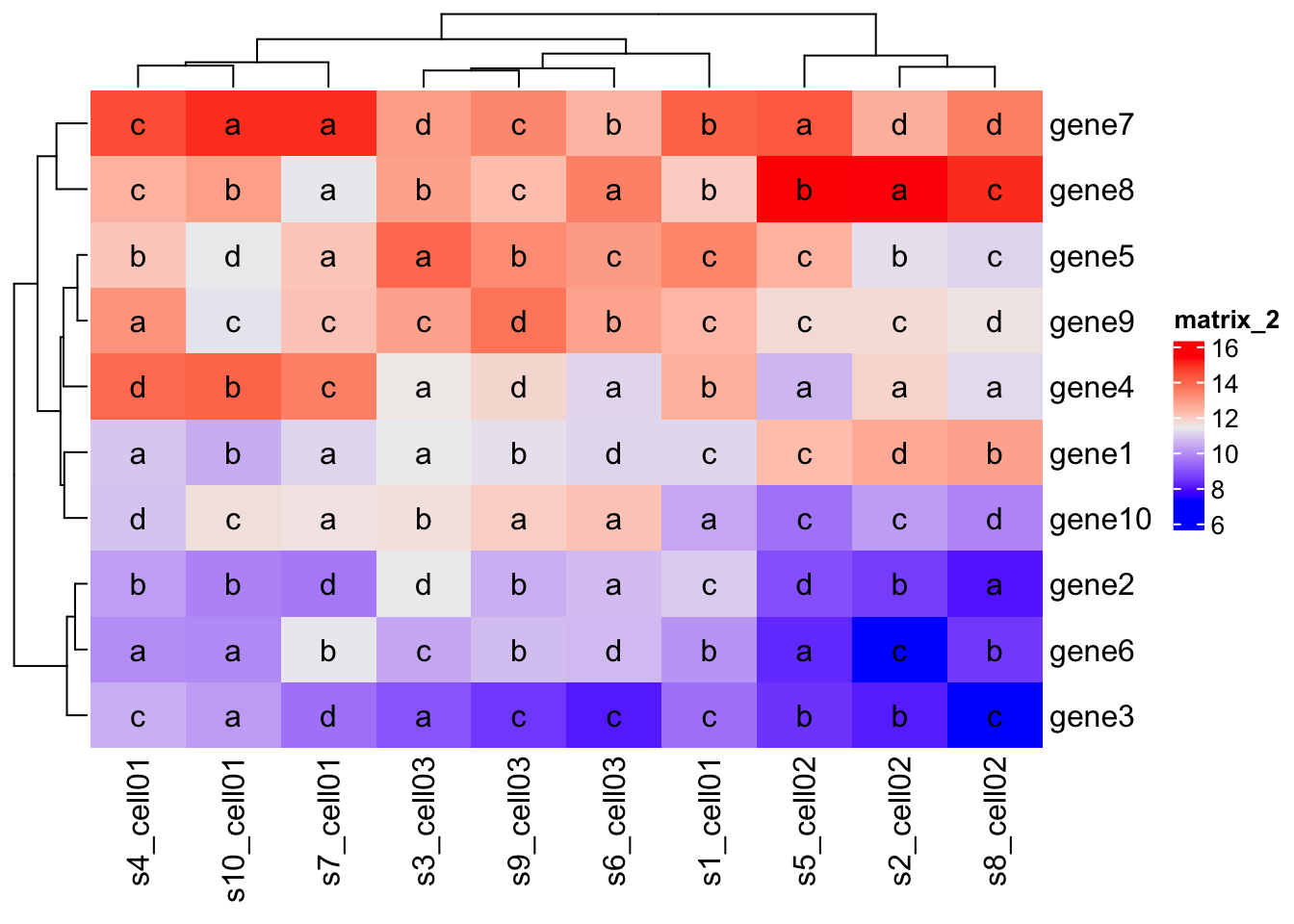
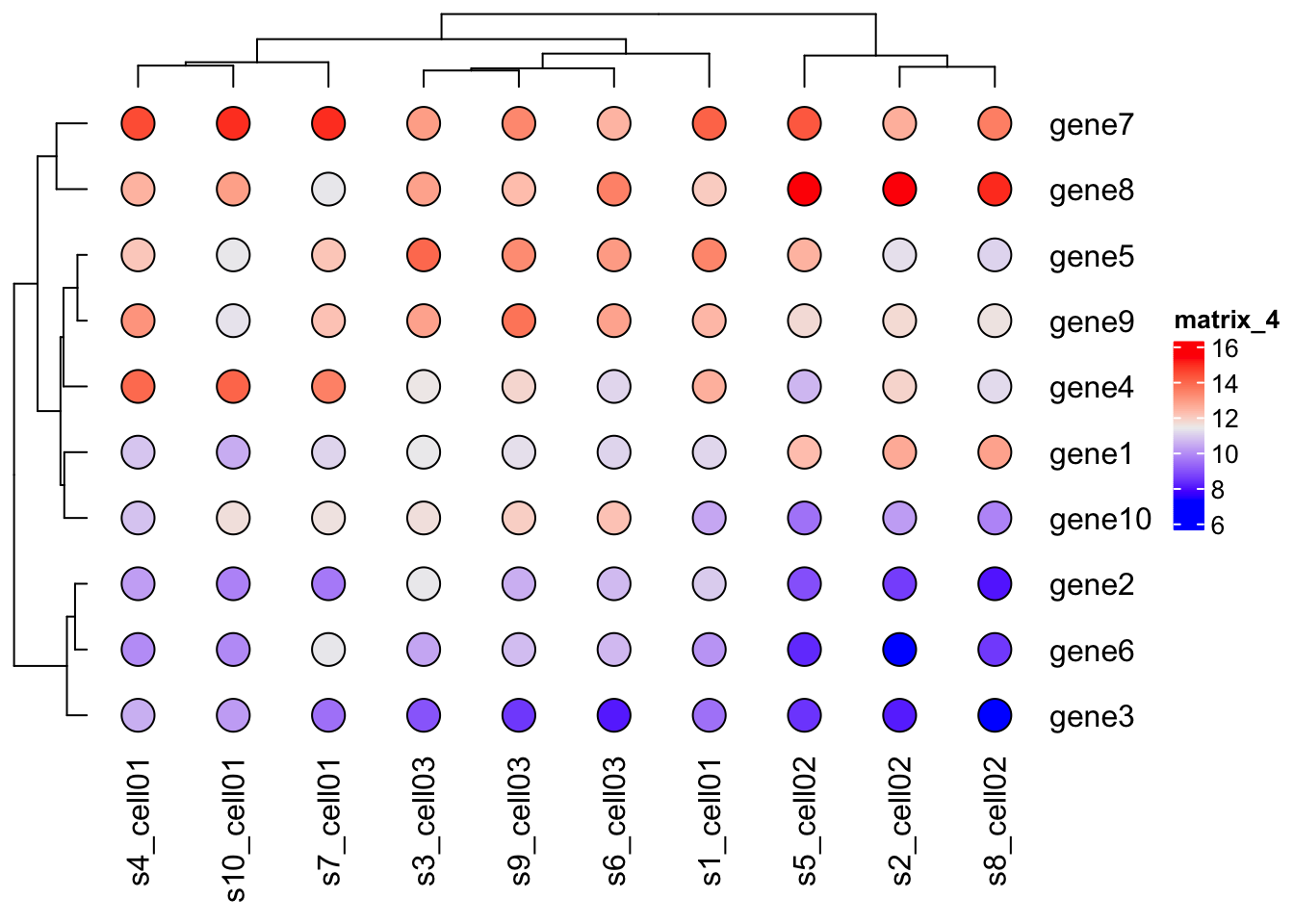
mat_letters = matrix(sample(letters[1:4], 100, replace = TRUE), 10)

Heatmap(mat,
        cell_fun = function(j, i, x, y, w, h, col) {
        grid.text(mat_letters[i, j], x, y)
    }
)
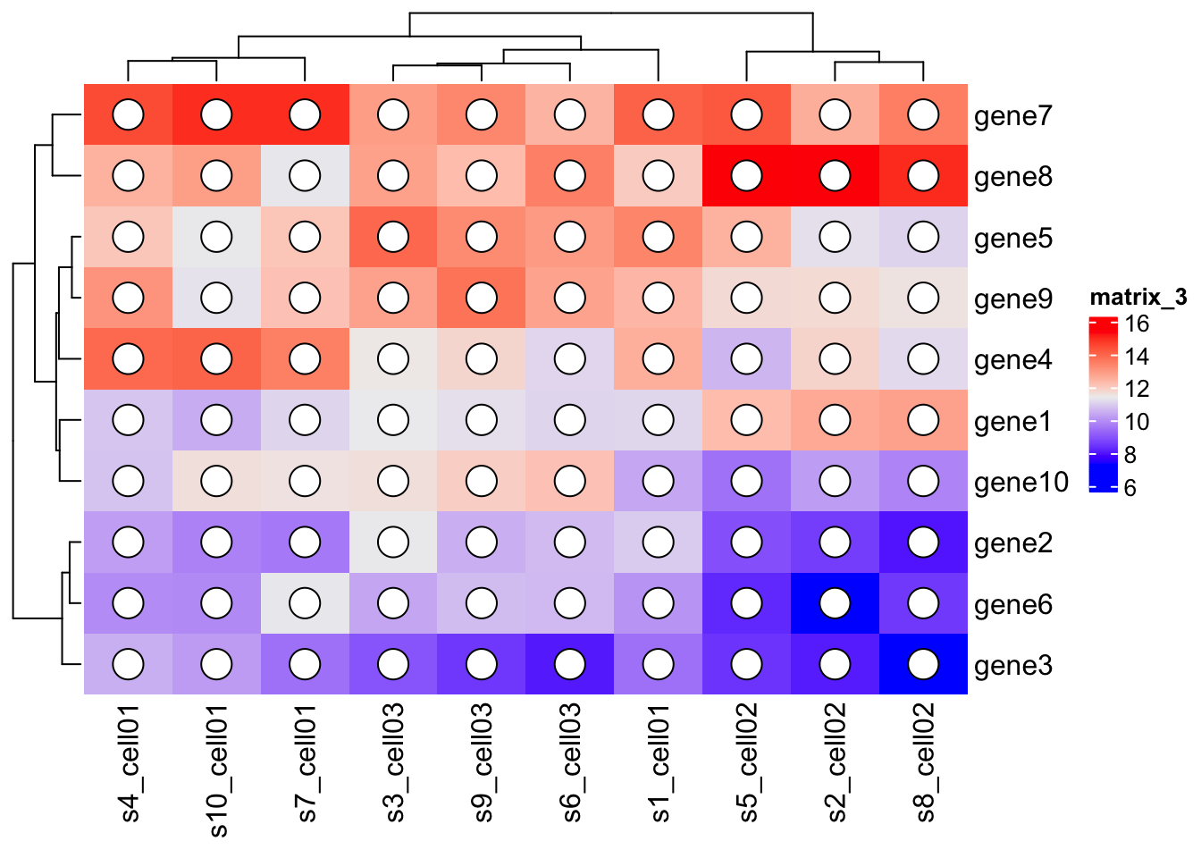
Heatmap(mat,
        cell_fun = function(j, i, x, y, w, h, col) {
          grid.circle(x, y, w*0.25, gp = gpar(fill = "white", col = "black"))
    }
)
Heatmap(mat,
        cell_fun = function(j, i, x, y, w, h, col) {
          grid.rect(x, y, w, h, gp = gpar(fill = "white", col = NA))
          grid.circle(x, y, w*0.25, gp = gpar(fill = col, col = "black"))
    }
)
Making A List of Heatmaps
You can arrange more than one heatmap on the plot from left to right.
If more than one heatmap are to be combined, users can append one
heatmap to the other by +
mat1 = mat
mat2 = as.matrix(expr[ 11:20, 1:10])

as_tibble(mat2)
## # A tibble: 10 × 10
## s1_cell01 s2_cell02 s3_cell03 s4_ce…¹ s5_ce…² s6_ce…³ s7_ce…⁴ s8_ce…⁵ s9_ce…⁶
## <dbl> <dbl> <dbl> <dbl> <dbl> <dbl> <dbl> <dbl> <dbl>
## 1 15.8 12.9 15.6 14.1 13.7 14.5 14.0 13.2 14.7
## 2 11.1 9.09 10.1 11.1 8.60 9.57 11.8 9.41 10.3
## 3 13.3 14.9 13.5 13.6 15.8 13.0 12.8 15.9 12.8
## 4 11.1 13.1 9.85 11.1 12.6 9.55 10.9 12.6 9.88
## 5 11.9 14.5 12.7 12.7 14.2 12.8 13.6 15.2 13.0
## 6 9.10 8.08 10.4 8.18 7.83 10.6 8.26 8.67 11.3
## 7 13.7 11.4 14.6 13.9 11.6 13.6 14.7 12.1 14.1
## 8 13.6 11.1 13.3 12.1 9.67 12.0 11.7 10.3 12.3
## 9 8.85 7.00 7.58 9.35 6.30 7.69 8.76 7.08 7.39
## 10 12.4 10.1 11.7 11.8 10.6 11.7 12.4 9.71 11.2
## # … with 1 more variable: s10_cell01 <dbl>, and abbreviated variable names
## # ¹s4_cell01, ²s5_cell02, ³s6_cell03, ⁴s7_cell01, ⁵s8_cell02, ⁶s9_cell03ht1 = Heatmap(mat1, name = "ht1")
ht2 = Heatmap(mat2, name = "ht2")
ht_list = ht1 + ht2
draw(ht_list)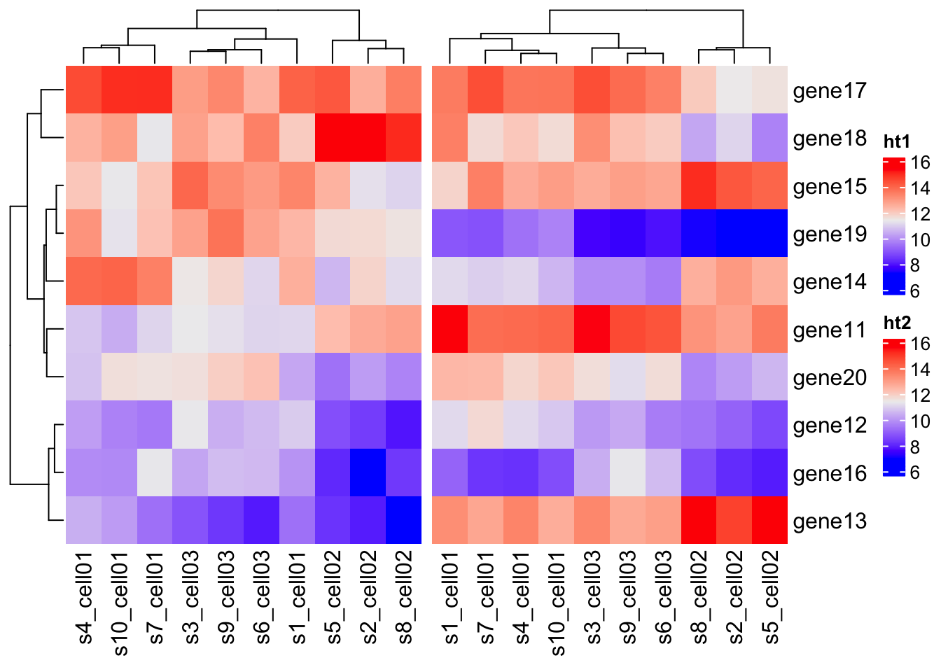
Again, there are parameters that you can tune. The most used are:
gap= adjust the gaps between heatmaps. Argument with a unit object.width= width of the heatmap.ht_opt= set graphic parameters for dimension names and titles as global settings.
ht_opt("heatmap_row_names_gp" = gpar(fontface = "italic"),
              "heatmap_column_names_gp" = gpar(fontsize = 5))
ht1 = Heatmap(mat1
              , name = "ht1"
              , column_title = "Heatmap 1"
              , km = 2, width = unit(2, 'cm')
              )

ht2 = Heatmap(mat2
              , name = "ht2"
              , column_title = "Heatmap 2"
              , width = unit(2, 'cm')
              )

ht_list = ht1 + ht2


draw(ht_list, gap = unit(1, "cm"))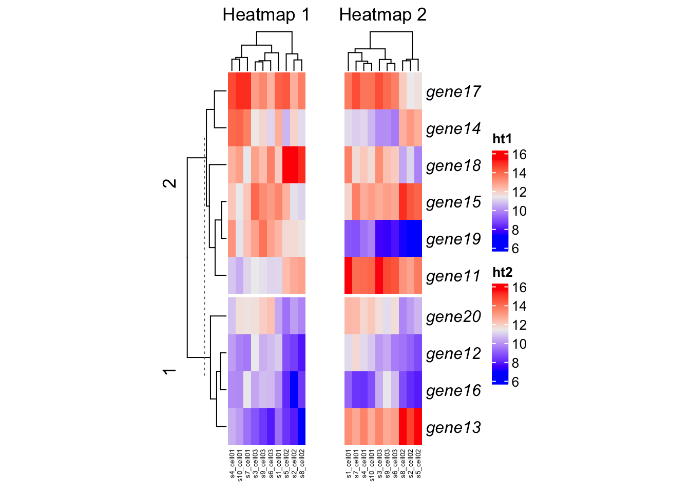
# Reset to original values
ht_opt(RESET = TRUE)
Heatmap Annotation
There is a HeatmapAnnotation class which is used to
define annotations on columns or rows.
Simple Annotation
A simple annotation is defined as a vector which contains discrete classes or continuous values.
as_tibble(mat)## # A tibble: 10 × 10
## s1_cell01 s2_cell02 s3_cell03 s4_ce…¹ s5_ce…² s6_ce…³ s7_ce…⁴ s8_ce…⁵ s9_ce…⁶
## <dbl> <dbl> <dbl> <dbl> <dbl> <dbl> <dbl> <dbl> <dbl>
## 1 11.1 12.7 11.4 10.8 12.3 11.1 11.1 12.8 11.2
## 2 10.9 8.56 11.4 10.2 8.86 10.7 9.60 7.96 10.5
## 3 9.45 8.04 8.94 10.5 8.40 8.01 9.44 7.04 8.46
## 4 12.6 11.8 11.5 13.9 10.6 11.1 13.5 11.2 11.8
## 5 13.4 11.3 14.0 12.1 12.5 13.0 12.1 11.0 13.3
## 6 10.0 7.26 10.3 9.91 8.22 10.7 11.3 8.49 10.7
## 7 14.1 12.6 12.9 14.5 14.3 12.5 15.0 13.5 13.4
## 8 12.0 15.5 12.8 12.5 17.4 13.5 11.3 15.0 12.3
## 9 12.4 11.7 12.8 13.1 11.7 12.8 12.2 11.5 13.8
## 10 10.4 10.2 11.6 10.8 9.47 12.2 11.6 9.78 11.9
## # … with 1 more variable: s10_cell01 <dbl>, and abbreviated variable names
## # ¹s4_cell01, ²s5_cell02, ³s6_cell03, ⁴s7_cell01, ⁵s8_cell02, ⁶s9_cell03df = data.frame(type = c( rep("a", 5)
, rep("b", 5)),
plate = sample(1:20, 10))
# First annotation
ha1 = HeatmapAnnotation( name="Plates"
, df = df
, col = list( type = c("a" = "red",
"b" = "blue")
, plate = colorRamp2(c(0, 20), c("black", "white"))
)
)
# Second annotation
ha2 = HeatmapAnnotation(name="Batches"
,df = data.frame(batch = sample(1:20, 10))
,col = list(batch = colorRamp2(c(0, 20), c("purple", "yellow")))
)
Heatmap(mat
, top_annotation = ha1
, bottom_annotation = ha2 )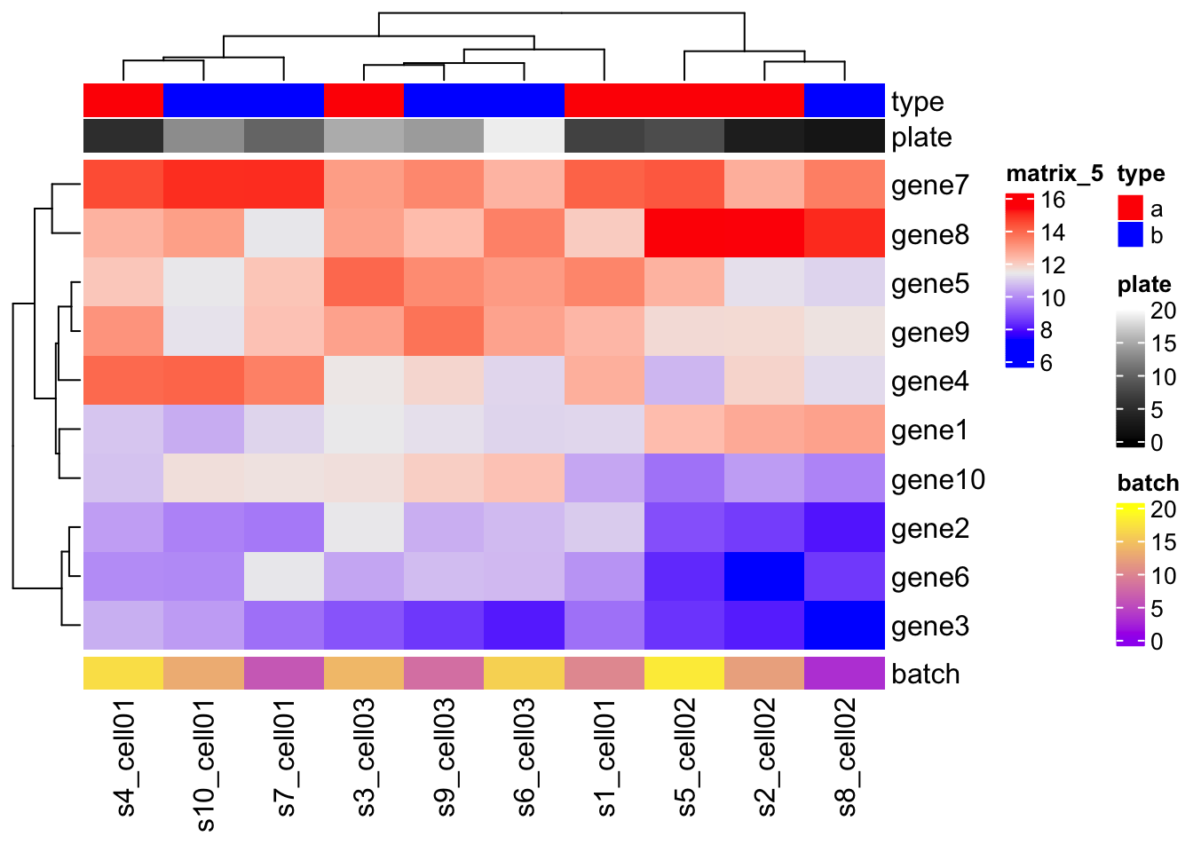
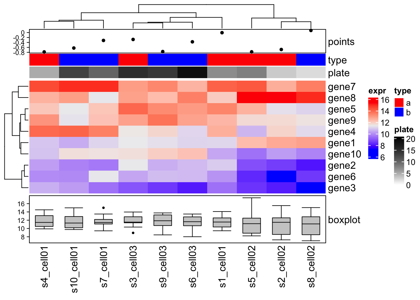
Complex annotations
The complex annotations are always represented as self-defined graphic functions.
For each column annotation, there will be a viewport created waiting for graphics.
The annotation function defines how to put the graphics to this viewport. The only argument of the function is an index of column which is already adjusted by column clustering.
There are ready-to-use function:
anno_points()anno_barplot()anno_boxplot()anno_histogram()anno_density()anno_text()
value = rnorm(10)

# POINTS
ha = HeatmapAnnotation(  df = df
                       , points = anno_points(value)
                       , col = list( type = c("a" = "red", "b" = "blue")
                                    ,plate = colorRamp2(c(0, 20), c("white", "black")))
                       )
# BOXPLOT
ha_boxplot = HeatmapAnnotation( boxplot = anno_boxplot(mat, axis = TRUE) )

Heatmap(mat
        , name = "expr"
        , top_annotation = ha
        , bottom_annotation = ha_boxplot
         )
Row annotation
Row annotation is also defined by the HeatmapAnnotation
class, but with specifying which to
row.
There is a helper function rowAnnotation() which is the
same as HeatmapAnnotation(…, which = “row”).
Similar as rowAnnotation(), there are corresponding wrapper anno_* functions that are almost the same as the original functions except pre-defined which argument to row.
row_anno_points()row_anno_barplot()row_anno_boxplot()row_anno_histogram()row_anno_density()row_anno_text()
ht1 = Heatmap(mat
        , name = "expr"
        , top_annotation = ha
        , bottom_annotation = ha_boxplot
        , km=2
        )

str(df)
## 'data.frame': 10 obs. of 2 variables:
## $ type : chr "a" "a" "a" "a" ...
## $ plate: int 7 3 15 5 8 19 10 2 14 13ha = rowAnnotation(df = df
, col = list(type = c("a" = "red", "b" = "blue"))
, boxplot = row_anno_boxplot(mat, axis = TRUE)
)
ht1 + ha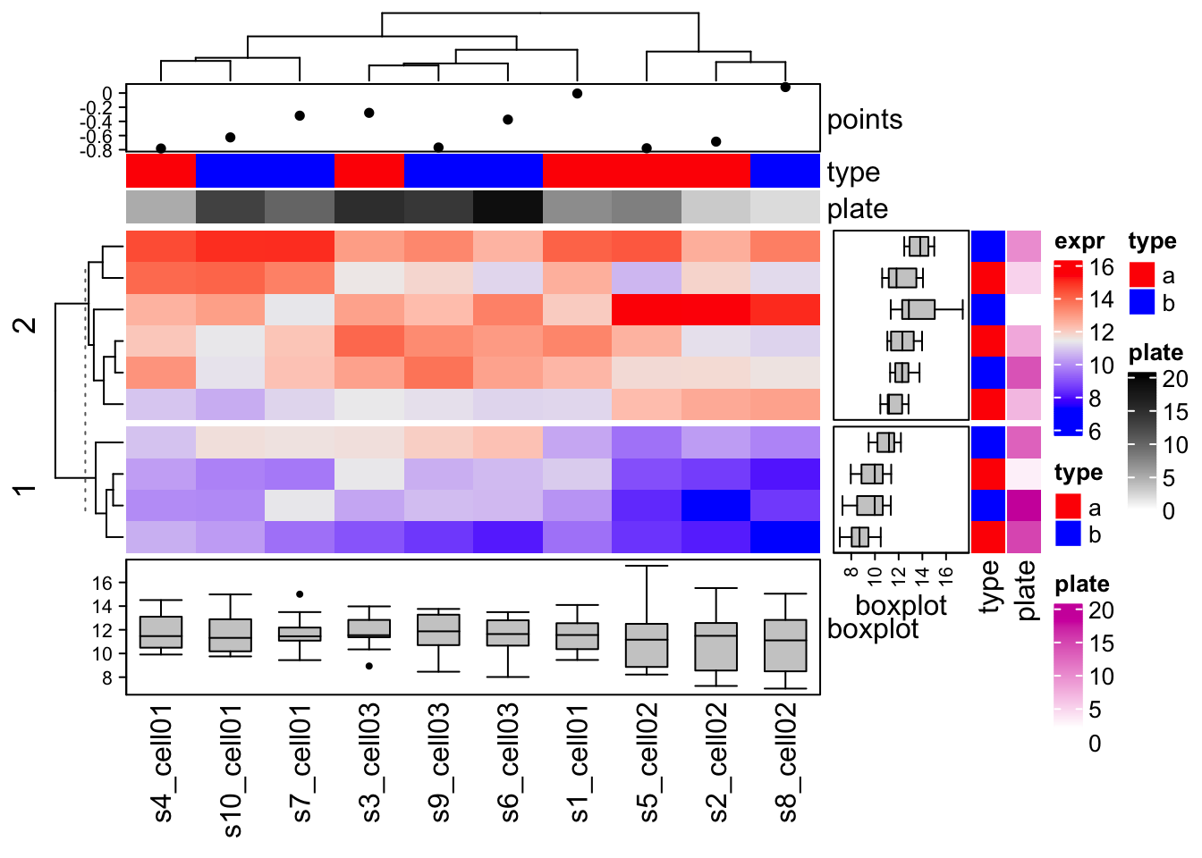
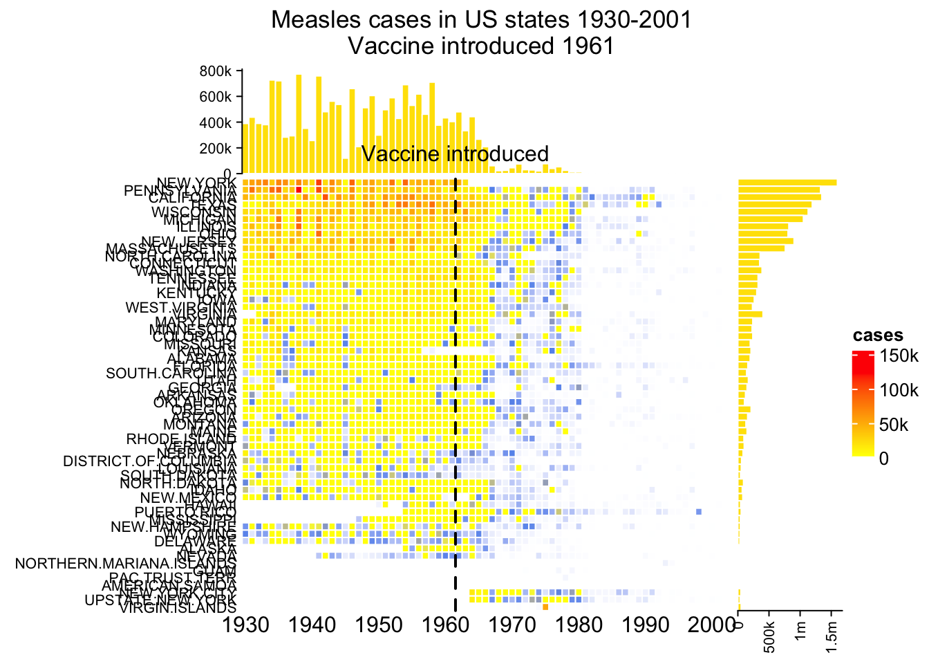
The measles vaccine heatmap
mat = readRDS(system.file("extdata", "measles.rds", package = "ComplexHeatmap"))
ha1 = HeatmapAnnotation(
    dist1 = anno_barplot(
        colSums(mat),
        bar_width = 1,
        gp = gpar(col = "white", fill = "#FFE200"),
        border = FALSE,
        axis_param = list(at = c(0, 2e5, 4e5, 6e5, 8e5),
            labels = c("0", "200k", "400k", "600k", "800k")),
        height = unit(2, "cm")
    ), show_annotation_name = FALSE)
ha2 = rowAnnotation(
    dist2 = anno_barplot(
        rowSums(mat),
        bar_width = 1,
        gp = gpar(col = "white", fill = "#FFE200"),
        border = FALSE,
        axis_param = list(at = c(0, 5e5, 1e6, 1.5e6),
            labels = c("0", "500k", "1m", "1.5m")),
        width = unit(2, "cm")
    ), show_annotation_name = FALSE)
year_text = as.numeric(colnames(mat))
year_text[year_text %% 10 != 0] = ""
ha_column = HeatmapAnnotation(
    year = anno_text(year_text, rot = 0, location = unit(1, "npc"), just = "top")
)
col_fun = colorRamp2(c(0, 800, 1000, 127000), c("white", "cornflowerblue", "yellow", "red"))
ht_list = Heatmap(mat, name = "cases", col = col_fun,
    cluster_columns = FALSE, show_row_dend = FALSE, rect_gp = gpar(col= "white"),
    show_column_names = FALSE,
    row_names_side = "left", row_names_gp = gpar(fontsize = 8),
    column_title = 'Measles cases in US states 1930-2001\nVaccine introduced 1961',
    top_annotation = ha1, bottom_annotation = ha_column,
    heatmap_legend_param = list(at = c(0, 5e4, 1e5, 1.5e5),
        labels = c("0", "50k", "100k", "150k"))) + ha2
draw(ht_list, ht_gap = unit(3, "mm"))
decorate_heatmap_body("cases", {
    i = which(colnames(mat) == "1961")
    x = i/ncol(mat)
    grid.lines(c(x, x), c(0, 1), gp = gpar(lwd = 2, lty = 2))
    grid.text("Vaccine introduced", x, unit(1, "npc") + unit(5, "mm"))
})
Let’s get fancy! 3D Heatmaps
set.seed(7)
mat = matrix(runif(100), 10)
rownames(mat) = LETTERS[1:10]
colnames(mat) = letters[1:10]
Heatmap3D(mat, name = "mat", column_title = "This is a 3D heatmap")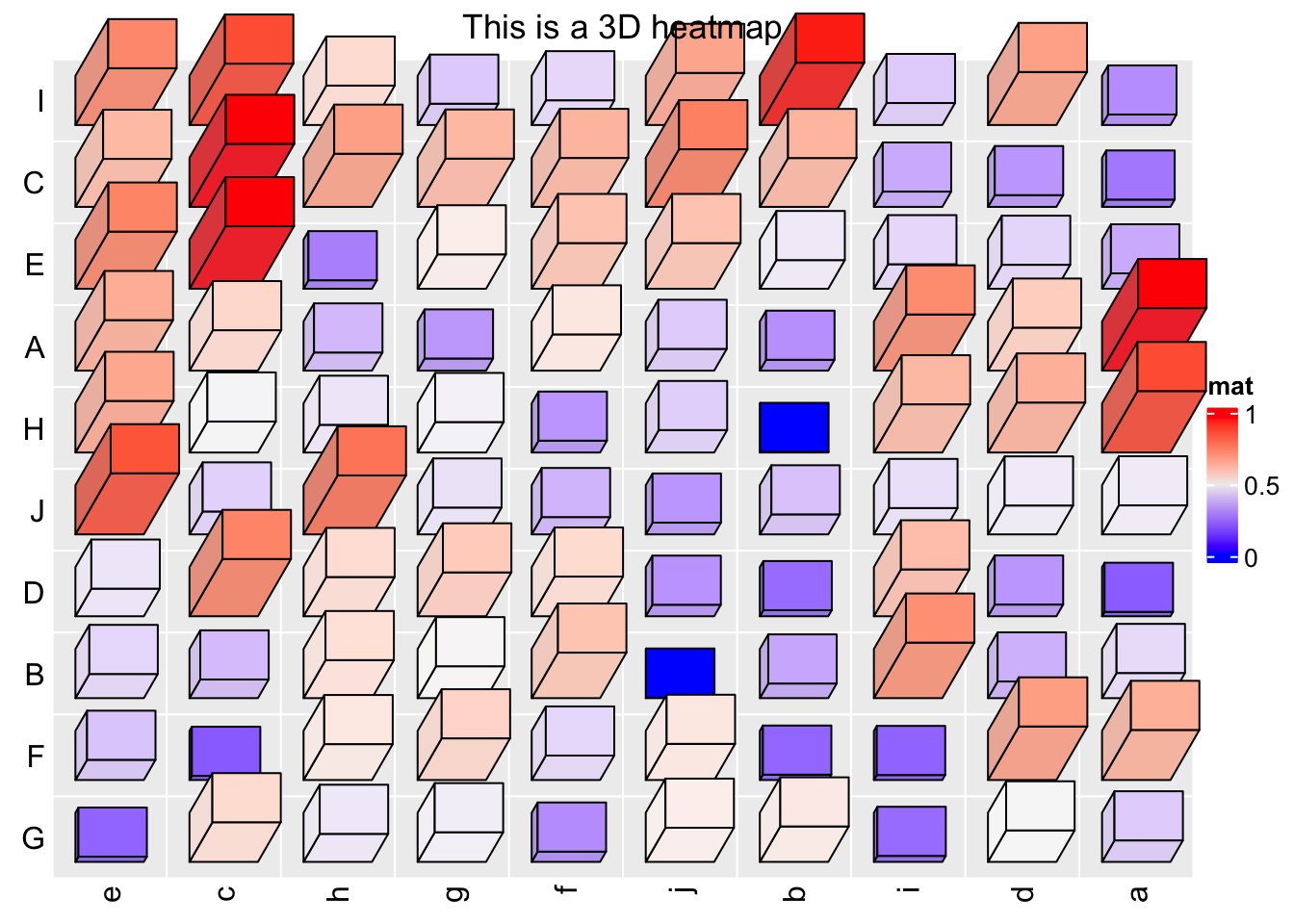
In ComplexHeatmap, there are several global options that control the spaces between heatmap components. To solve the problem of title overlapping with heatmap in the previous example, we can manually set a proper value for ht_opt\(HEATMAP_LEGEND_PADDING and ht_opt\)TITLE_PADDING.
ht_opt$HEATMAP_LEGEND_PADDING = unit(5, "mm")
ht_opt$TITLE_PADDING = unit(c(9, 2), "mm") # bottom and top padding
Heatmap3D(mat, name = "mat", column_title = "This is a 3D heatmap")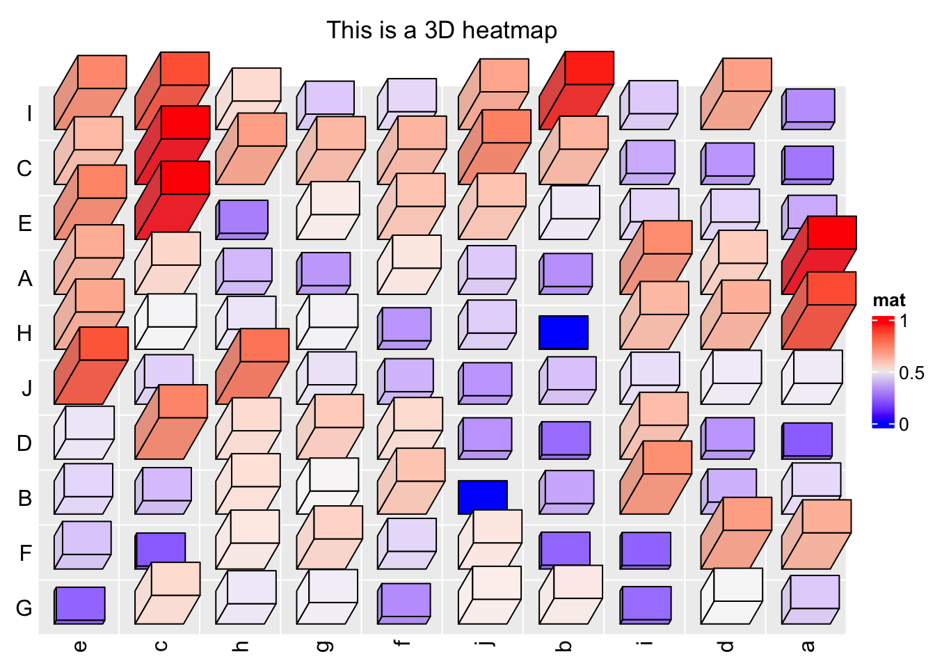
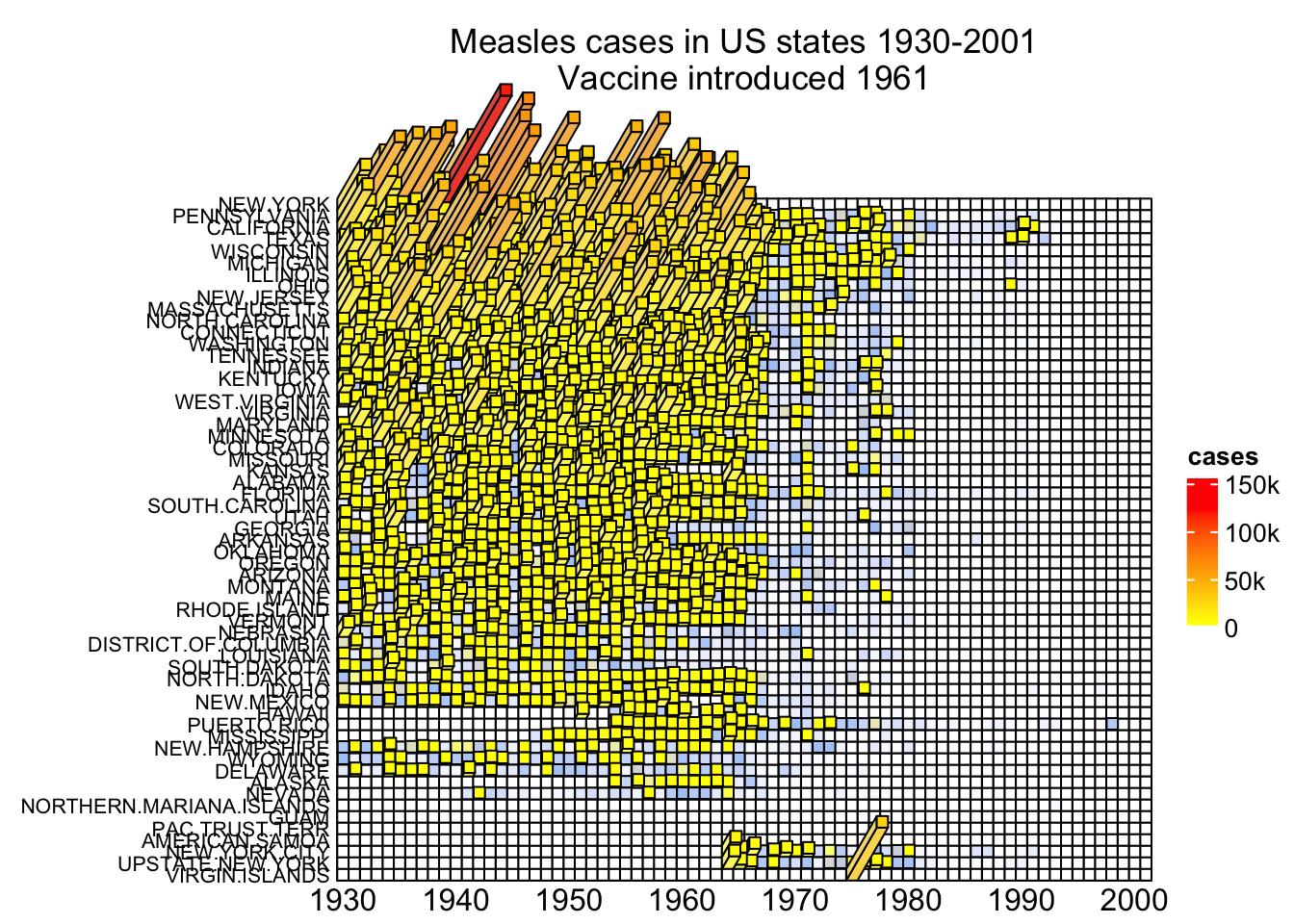
Now let’s plot a 3D measles vaccine heatmap
mat = readRDS(system.file("extdata", "measles.rds", package = "ComplexHeatmap"))
year_text = as.numeric(colnames(mat))
year_text[year_text %% 10 != 0] = ""
ha_column = HeatmapAnnotation(
    year = anno_text(year_text, rot = 0, location = unit(1, "npc"), just = "top")
)
col_fun = circlize::colorRamp2(c(0, 800, 1000, 127000), c("white", "cornflowerblue", "yellow", "red"))
ht_opt$TITLE_PADDING = unit(c(15, 2), "mm")
Heatmap3D(mat, name = "cases", col = col_fun,
    cluster_columns = FALSE, show_row_dend = FALSE,
    show_column_names = FALSE,
    row_names_side = "left", row_names_gp = gpar(fontsize = 8),
    column_title = 'Measles cases in US states 1930-2001\nVaccine introduced 1961',
    bottom_annotation = ha_column,
    heatmap_legend_param = list(at = c(0, 5e4, 1e5, 1.5e5),
        labels = c("0", "50k", "100k", "150k")),
    # new arguments for Heatmap3D()
    bar_rel_width = 1, bar_rel_height = 1, bar_max_length = unit(2, "cm")
)
UpSet plot
UpSet plot provides an efficient way to visualize intersections of multiple sets compared to the traditional approaches, i.e. the Venn Diagram. It is implemented in the UpSetR package in R. Here we re-implemented UpSet plots with the ComplexHeatmap package with some improvements.
The UpSet plot visualizes the size of each combination set. With the binary code of each combination set, next we need to define how to calculate the size of that combination set. There are three modes:
distinct mode: 1 means in that set and 0 means not in that set, then 1 1 0 means a set of elements both in set A and B, while not in C (setdiff(intersect(A, B), C)). Under this mode, the seven combination sets are the seven partitions in the Venn diagram and they are mutually exclusive.

intersect mode: 1 means in that set and 0 is not taken into account, then, 1 1 0 means a set of elements in set A and B, and they can also in C or not in C (intersect(A, B)). Under this mode, the seven combination sets can overlap.

union mode: 1 means in that set and 0 is not taken into account. When there are multiple 1, the relationship is OR. Then, 1 1 0 means a set of elements in set A or B, and they can also in C or not in C (union(A, B)). Under this mode, the seven combination sets can overlap.
The three modes are illustrated in following figure:

Make the combination matrix
The function make_comb_mat() generates the combination matrix as well as calculates the size of the sets and the combination sets. The input can be one single variable or name-value pairs:
set.seed(123)
lt = list(a = sample(letters, 5),
          b = sample(letters, 10),
          c = sample(letters, 15))
m1 = make_comb_mat(lt)
m1
## A combination matrix with 3 sets and 7 combinations.
## ranges of combination set size: c(1, 8).
## mode for the combination size: distinct.
## sets are on rows.
##
## Combination sets are:
## a b c code size
## x x x 111 2
## x x 110 1
## x x 101 1
## x x 011 4
## x 100 1
## x 010 3
## x 001 8
##
## Sets are:
## set size
## a 5
## b 10
## c 15m2 = make_comb_mat(a = lt$a, b = lt$b, c = lt$c)
m3 = make_comb_mat(list_to_matrix(lt))m1, m2 and m3 are identical.
The mode is controlled by the mode argument:
m1 = make_comb_mat(lt) # the default mode is `distinct`
UpSet(m1)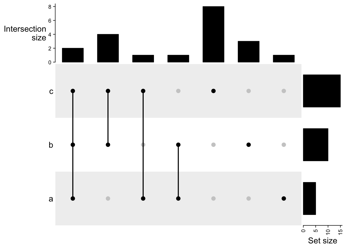
m2 = make_comb_mat(lt, mode = "intersect")
UpSet(m2)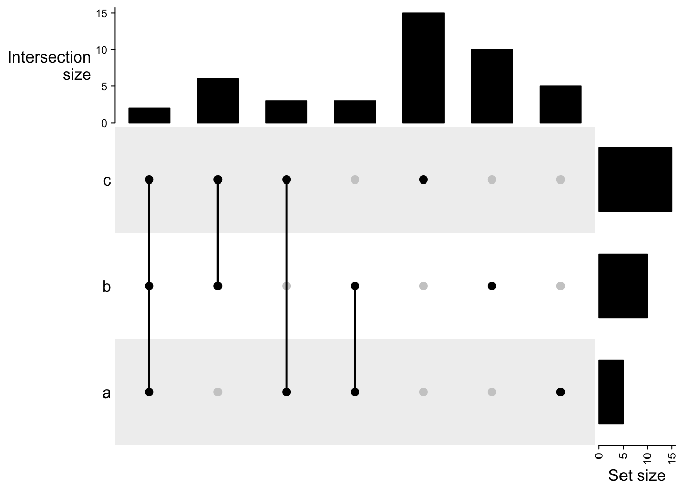
m3 = make_comb_mat(lt, mode = "union")
UpSet(m3)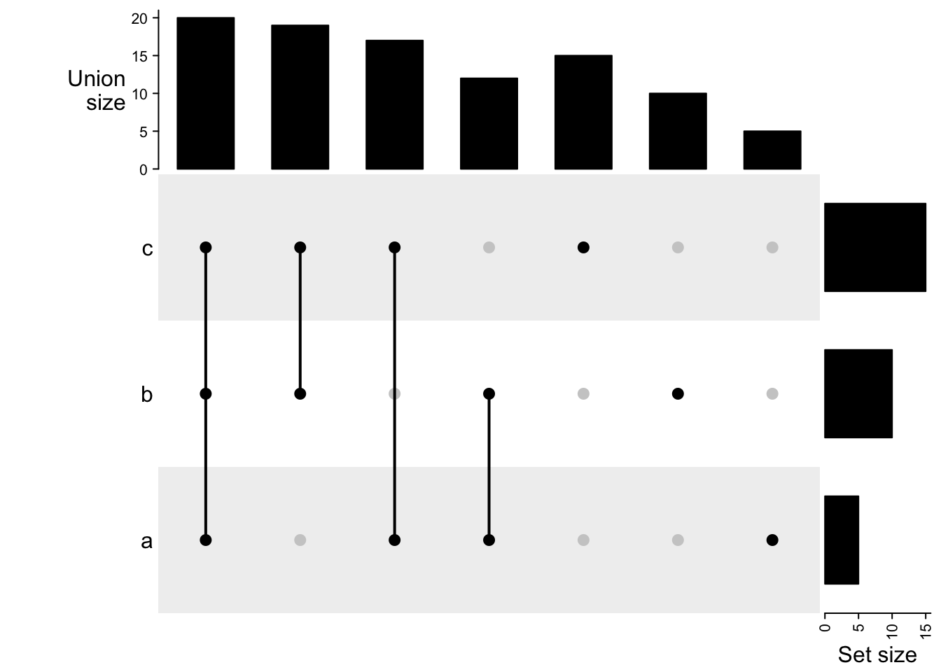
Next we demonstrate a second example, where the sets are genomic regions. When the sets are genomic regions, the size is calculated as the sum of the width of regions in each set (or in other words, the total number of base pairs).
library(circlize)
library(GenomicRanges)
## Loading required package: stats4## Loading required package: BiocGenerics##
## Attaching package: 'BiocGenerics'## The following objects are masked from 'package:dplyr':
##
## combine, intersect, setdiff, union## The following objects are masked from 'package:stats':
##
## IQR, mad, sd, var, xtabs## The following objects are masked from 'package:base':
##
## anyDuplicated, aperm, append, as.data.frame, basename, cbind,
## colnames, dirname, do.call, duplicated, eval, evalq, Filter, Find,
## get, grep, grepl, intersect, is.unsorted, lapply, Map, mapply,
## match, mget, order, paste, pmax, pmax.int, pmin, pmin.int,
## Position, rank, rbind, Reduce, rownames, sapply, setdiff, sort,
## table, tapply, union, unique, unsplit, which.max, which.min## Loading required package: S4Vectors##
## Attaching package: 'S4Vectors'## The following objects are masked from 'package:dplyr':
##
## first, rename## The following object is masked from 'package:tidyr':
##
## expand## The following objects are masked from 'package:base':
##
## expand.grid, I, unname## Loading required package: IRanges##
## Attaching package: 'IRanges'## The following objects are masked from 'package:dplyr':
##
## collapse, desc, slice## The following object is masked from 'package:purrr':
##
## reduce## Loading required package: GenomeInfoDblt2 = lapply(1:4, function(i) generateRandomBed())
lt2 = lapply(lt2, function(df) GRanges(seqnames = df[, 1],
ranges = IRanges(df[, 2], df[, 3])))
names(lt2) = letters[1:4]
m2 = make_comb_mat(lt2)
m2## A combination matrix with 4 sets and 15 combinations.
## ranges of combination set size: c(184941701, 199900416).
## mode for the combination size: distinct.
## sets are on rows.
##
## Top 8 combination sets are:
## a b c d code size
## x x 0011 199900416
## x 1000 199756519
## x x x 1011 198735008
## x x x x 1111 197341532
## x x x 1110 197137160
## x x x 1101 194569926
## x x 1001 194462988
## x x 1010 192670258
##
## Sets are:
## set size
## a 1566783009
## b 1535968265
## c 1560549760
## d 1552480645UpSet(m2)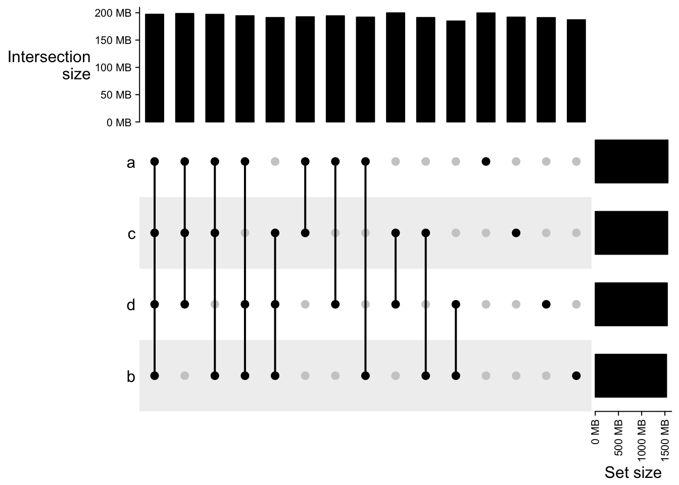
UpSet plots as heatmaps
In the UpSet plot, the major component is the combination matrix, and on the two sides are the barplots representing the size of sets and the combination sets, thus, it is quite straightforward to implement it as a “heatmap” where the heatmap is self-defined with dots and segments, and the two barplots are two barplot annotations constructed by anno_barplot().
The default top annotation is:
HeatmapAnnotation("Intersection\nsize" = anno_barplot(comb_size(m2),
        border = FALSE, gp = gpar(fill = "black"), height = unit(3, "cm")),
    annotation_name_side = "left", annotation_name_rot = 0)
## A HeatmapAnnotation object with 1 annotation
## name: heatmap_annotation_15
## position: column
## items: 15
## width: 1npc
## height: 30mm
## this object is subsettable
## 35.1606333333333mm extension on the left
##
## name annotation_type color_mapping height
## Intersection\nsize anno_barplot() 30mmThis top annotation is wrapped in upset_top_annotation() which only contais the upset top barplot annotation. Most of the arguments in upset_top_annotation() directly go to the anno_barplot(), e.g. to set the colors of bars:
UpSet(m2, top_annotation = upset_top_annotation(m2,
    gp = gpar(col = comb_degree(m2))))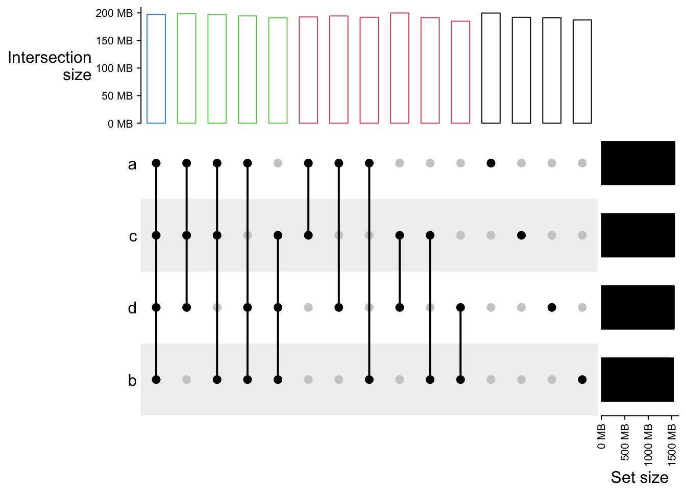
Oncoprint
OncoPrint is common standard to visualize multiple genomic alterations events in cancer genomes.
The ComplexHeatmap package provides a oncoPrint()
function.
Apply oncoprint to the cBioPortal dataset
We use a real-world dataset to demonstrate advanced usage of oncoPrint(). The data is retrieved from cBioPortal. Steps for getting the data are as follows:
go to http://www.cbioportal.org,
search Cancer Study: “Lung Adenocarcinoma Carcinoma” and select: “Lung Adenocarcinoma Carcinoma (TCGA, Provisinal),”
in “Enter Gene Set” field, select: “General: Ras-Raf-MEK-Erk/JNK signaling (26 genes),”
submit the form.
In the result page,
go to “Download” tab, download text in “Type of Genetic alterations across all cases.”The order of samples can also be downloaded from the results page,
go to “OncoPrint” tab, move the mouse above the plot, click “download” icon and click “Sample order.”The data is already in ComplexHeatmap package. First we read the data and make some pre-processing.
mat = read.table(system.file("extdata", package = "ComplexHeatmap",
    "tcga_lung_adenocarcinoma_provisional_ras_raf_mek_jnk_signalling.txt"),
    header = TRUE, stringsAsFactors = FALSE, sep = "\t")
mat[is.na(mat)] = ""
rownames(mat) = mat[, 1]
mat = mat[, -1]
mat=  mat[, -ncol(mat)]
mat = t(as.matrix(mat))
mat[1:3, 1:3]
## TCGA-05-4384-01 TCGA-05-4390-01 TCGA-05-4425-01
## KRAS " " "MUT;" " "
## HRAS " " " " " "
## BRAF " " " " " "There are three different alterations in mat: HOMDEL, AMP and MUT. We first define how to add graphics for different alterations.
col = c("HOMDEL" = "blue", "AMP" = "red", "MUT" = "#008000")
alter_fun = list(
    background = function(x, y, w, h) {
        grid.rect(x, y, w-unit(2, "pt"), h-unit(2, "pt"),
            gp = gpar(fill = "#CCCCCC", col = NA))
    },
    # big blue
    HOMDEL = function(x, y, w, h) {
        grid.rect(x, y, w-unit(2, "pt"), h-unit(2, "pt"),
            gp = gpar(fill = col["HOMDEL"], col = NA))
    },
    # big red
    AMP = function(x, y, w, h) {
        grid.rect(x, y, w-unit(2, "pt"), h-unit(2, "pt"),
            gp = gpar(fill = col["AMP"], col = NA))
    },
    # small green
    MUT = function(x, y, w, h) {
        grid.rect(x, y, w-unit(2, "pt"), h*0.33,
            gp = gpar(fill = col["MUT"], col = NA))
    }
)
Just a note, since the graphics are all rectangles, they can be simplied by generating by alter_graphic():
# just for demonstration
alter_fun = list(
    background = alter_graphic("rect", fill = "#CCCCCC"),
    HOMDEL = alter_graphic("rect", fill = col["HOMDEL"]),
    AMP = alter_graphic("rect", fill = col["AMP"]),
    MUT = alter_graphic("rect", height = 0.33, fill = col["MUT"])
)
Now we make the oncoPrint. We save column_title and heatmap_legend_param as varaibles because they are used multiple times in following code chunks.
column_title = "TCGA Lung Adenocarcinoma, genes in Ras Raf MEK JNK signalling"
heatmap_legend_param = list(title = "Alternations", at = c("HOMDEL", "AMP", "MUT"),
        labels = c("Deep deletion", "Amplification", "Mutation"))
oncoPrint(mat,
    alter_fun = alter_fun, col = col,
    column_title = column_title, heatmap_legend_param = heatmap_legend_param)
## All mutation types: MUT, AMP, HOMDEL.## `alter_fun` is assumed vectorizable. If it does not generate correct
## plot, please set `alter_fun_is_vectorized = FALSE` in `oncoPrint()`.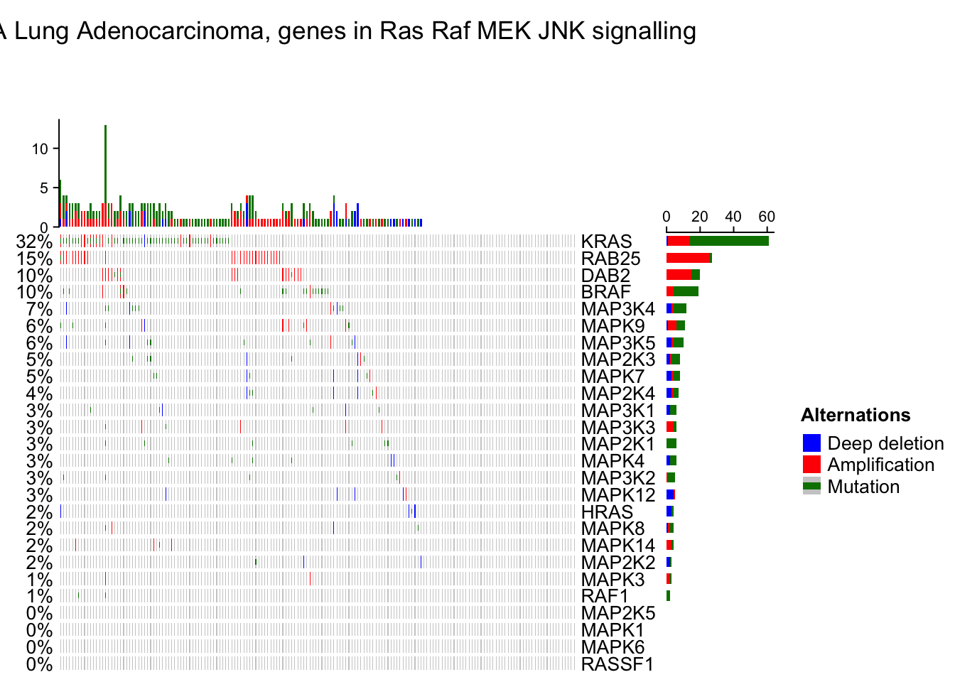
# As you see, the genes and samples are reordered automatically. Rows are sorted based on the frequency of the alterations in all samples and columns are reordered to visualize the mutual exclusivity between samples.Remove empty rows and columns
By default, if samples or genes have no alterations, they will still remain in the heatmap, but you can set remove_empty_columns and remove_empty_rows to TRUE to remove them:
oncoPrint(mat,
    alter_fun = alter_fun, col = col,
    remove_empty_columns = TRUE, remove_empty_rows = TRUE,
    column_title = column_title, heatmap_legend_param = heatmap_legend_param)
## All mutation types: MUT, AMP, HOMDEL.## `alter_fun` is assumed vectorizable. If it does not generate correct
## plot, please set `alter_fun_is_vectorized = FALSE` in `oncoPrint()`.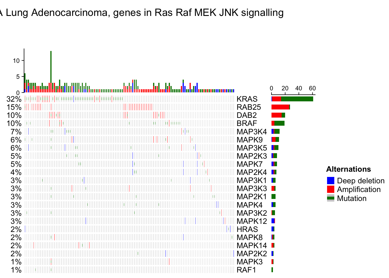
The number of rows and columns may be reduced after empty rows and columns are removed. All the components of the oncoPrint are adjusted accordingly. When the oncoPrint is concatenated with other heatmaps and annotations, this may cause a problem that the number of rows or columns are not all identical in the heatmap list. So, if you put oncoPrint into a heatmap list and you don’t want to see empty rows or columns, you need to remove them manually before sending to oncoPrint() function (this preprocess should be very easy for you!).
Reorder the oncoPrint
As the normal Heatmap() function, row_order or column_order can be assigned with a vector of orders (either numeric or character). In following example, the order of samples are gathered from cBio as well. You can see the difference for the sample order between ‘memo sort’ and the method used by cBio.
sample_order = scan(paste0(system.file("extdata", package = "ComplexHeatmap"),
    "/sample_order.txt"), what = "character")
oncoPrint(mat,
    alter_fun = alter_fun, col = col,
    row_order = 1:nrow(mat), column_order = sample_order,
    remove_empty_columns = TRUE, remove_empty_rows = TRUE,
    column_title = column_title, heatmap_legend_param = heatmap_legend_param)
## All mutation types: MUT, AMP, HOMDEL.## `alter_fun` is assumed vectorizable. If it does not generate correct
## plot, please set `alter_fun_is_vectorized = FALSE` in `oncoPrint()`.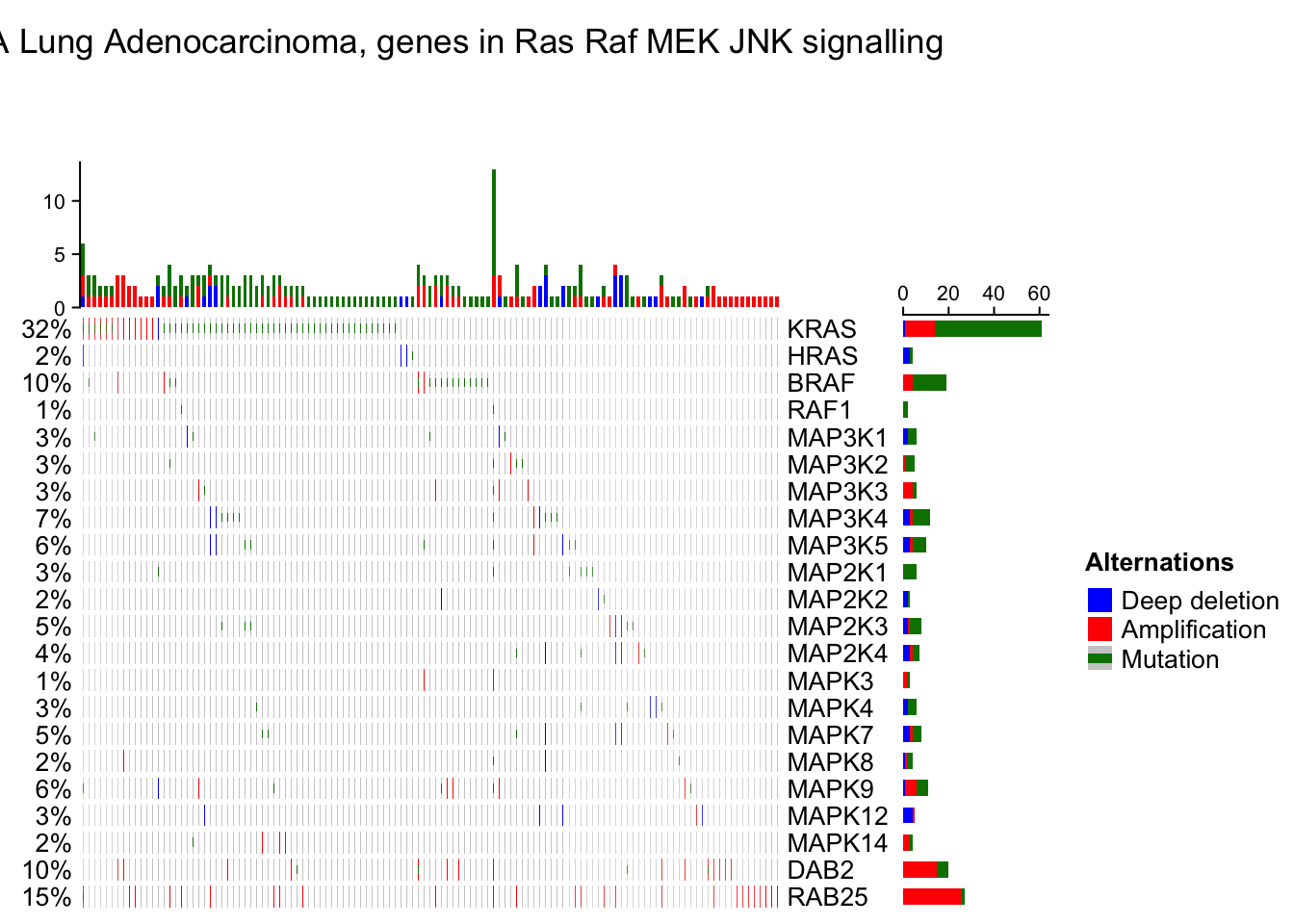
OncoPrint annotations
The oncoPrint has several pre-defined annotations.
On top and right of the oncoPrint, there are barplots showing the number of different alterations for each gene or for each sample, and on the left of the oncoPrint is a text annotation showing the percent of samples that have alterations for every gene.
The barplot annotation is implemented by anno_oncoprint_barplot() where you can set the the annotation there. Barplots by default draw for all alteration types, but you can also select subset of alterations to put on barplots by setting in anno_oncoprint_barplot(). anno_oncoprint_barplot() is a simple wrapper around anno_barplot() where the frequency matrix in just interanlly calculated. See following example:
oncoPrint(mat,
    alter_fun = alter_fun, col = col,
    top_annotation = HeatmapAnnotation(
        column_barplot = anno_oncoprint_barplot("MUT", border = TRUE, # only MUT
            height = unit(4, "cm"))
    ),
    right_annotation = rowAnnotation(
        row_barplot = anno_oncoprint_barplot(c("AMP", "HOMDEL"),  # only AMP and HOMDEL
            border = TRUE, height = unit(4, "cm"),
            axis_param = list(side = "bottom", labels_rot = 90))
    ),
    remove_empty_columns = TRUE, remove_empty_rows = TRUE,
    column_title = column_title, heatmap_legend_param = heatmap_legend_param)
## All mutation types: MUT, AMP, HOMDEL.## `alter_fun` is assumed vectorizable. If it does not generate correct
## plot, please set `alter_fun_is_vectorized = FALSE` in `oncoPrint()`.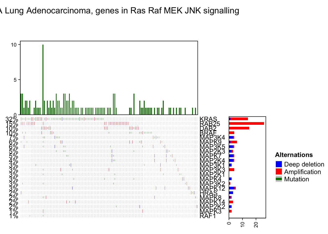
By default the barplot annotation shows the frequencies. The values can be changed to fraction by setting show_fraction = TRUE in anno_oncoprint_barplot():
oncoPrint(mat,
    alter_fun = alter_fun, col = col,
    top_annotation = HeatmapAnnotation(
        column_barplot = anno_oncoprint_barplot(show_fraction = TRUE)
    ),
    right_annotation = rowAnnotation(
        row_barplot = anno_oncoprint_barplot(show_fraction = TRUE)
    ),
    remove_empty_columns = TRUE, remove_empty_rows = TRUE,
    column_title = column_title, heatmap_legend_param = heatmap_legend_param)
## All mutation types: MUT, AMP, HOMDEL.## `alter_fun` is assumed vectorizable. If it does not generate correct
## plot, please set `alter_fun_is_vectorized = FALSE` in `oncoPrint()`.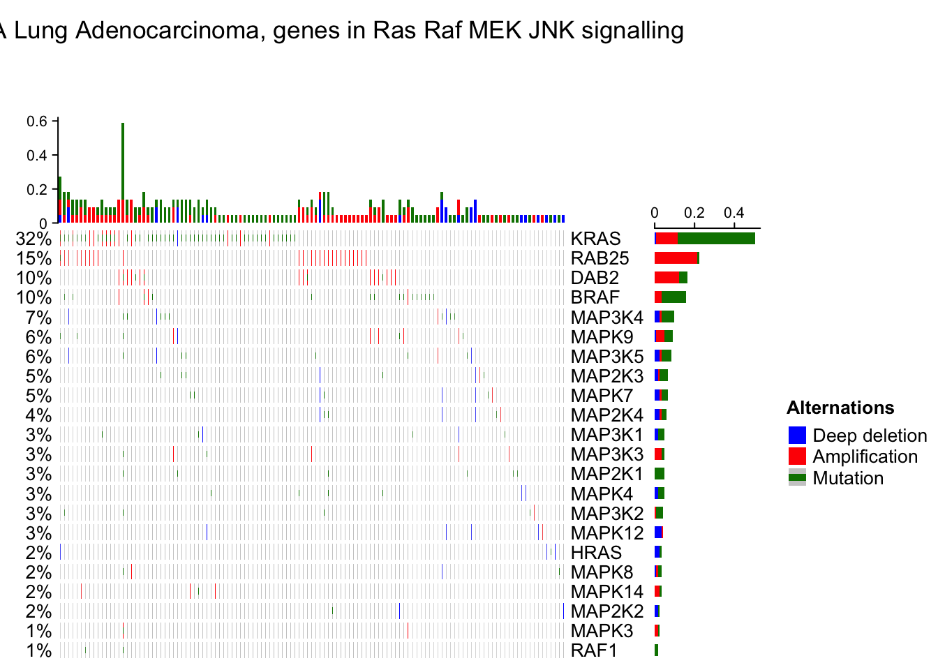
The percent values and row names are internally constructed as text annotations. You can set show_pct and show_row_names to turn them on or off. pct_side and row_names_side controls the sides where they are put.
oncoPrint(mat,
    alter_fun = alter_fun, col = col,
    remove_empty_columns = TRUE, remove_empty_rows = TRUE,
    pct_side = "right", row_names_side = "left",
    column_title = column_title, heatmap_legend_param = heatmap_legend_param)
## All mutation types: MUT, AMP, HOMDEL.## `alter_fun` is assumed vectorizable. If it does not generate correct
## plot, please set `alter_fun_is_vectorized = FALSE` in `oncoPrint()`.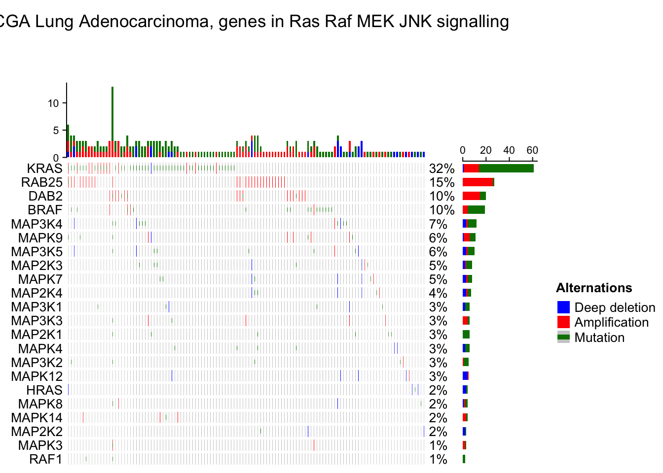
Genome-level heatmap
Many people are interested in making genome-scale heatmap with multiple tracks, like examples here and here. In this chapter, I will demonstrate how to implement it with ComplexHeatmap.
To make genome-scale plot, we first need the ranges on chromosome-level. There are many ways to obtain this information. In following, I use circlize::read.chromInfo() function.
library(circlize) library(GenomicRanges) chr_df = read.chromInfo()\(df chr_df = chr_df[chr_df\)chr %in% paste0(“chr”, 1:22), ] chr_gr = GRanges(seqnames = chr_df[, 1], ranges = IRanges(chr_df[, 2] + 1, chr_df[, 3])) chr_gr
Genome-level heatmap
Many people are interested in making genome-scale heatmap with multiple tracks, like examples here and here. In this section, we will look to how to implement it with ComplexHeatmap.
To make genome-scale plot, we first need the ranges on chromosome-level. There are many ways to obtain this information. In following, I use circlize::read.chromInfo() function.
library(circlize)
library(GenomicRanges)
chr_df = read.chromInfo()$df
chr_df = chr_df[chr_df$chr %in% paste0("chr", 1:22), ]
chr_gr = GRanges(seqnames = chr_df[, 1], ranges = IRanges(chr_df[, 2] + 1, chr_df[, 3]))
chr_gr
## GRanges object with 22 ranges and 0 metadata columns:
## seqnames ranges strand
## <Rle> <IRanges> <Rle>
## [1] chr1 1-249250621 *
## [2] chr2 1-243199373 *
## [3] chr3 1-198022430 *
## [4] chr4 1-191154276 *
## [5] chr5 1-180915260 *
## ... ... ... ...
## [18] chr18 1-78077248 *
## [19] chr19 1-59128983 *
## [20] chr20 1-63025520 *
## [21] chr21 1-48129895 *
## [22] chr22 1-51304566 *
## -------
## seqinfo: 22 sequences from an unspecified genome; no seqlengthsIn the final heatmap, each row (if the genomic direction is vertical) or each column (if the genomic direction is horizontal) actually represents a genomic window, thus we need to split the genome with equal-width windows. Here we use EnrichedHeatmap::makeWindows() function to split the genome by 1MB window (The two meta-columns in chr_window can be ignored here).
library(EnrichedHeatmap)## ========================================
## EnrichedHeatmap version 1.27.2
## Bioconductor page: http://bioconductor.org/packages/EnrichedHeatmap/
## Github page: https://github.com/jokergoo/EnrichedHeatmap
## Documentation: http://bioconductor.org/packages/EnrichedHeatmap/
##
## If you use it in published research, please cite:
## Gu, Z. EnrichedHeatmap: an R/Bioconductor package for comprehensive
## visualization of genomic signal associations. BMC Genomics 2018.
##
## This message can be suppressed by:
## suppressPackageStartupMessages(library(EnrichedHeatmap))
## ========================================chr_window = makeWindows(chr_gr, w = 1e6)
chr_window## GRanges object with 2875 ranges and 2 metadata columns:
## seqnames ranges strand | .i_query .i_window
## <Rle> <IRanges> <Rle> | <integer> <integer>
## [1] chr1 1-1000000 * | 1 1
## [2] chr1 1000001-2000000 * | 1 2
## [3] chr1 2000001-3000000 * | 1 3
## [4] chr1 3000001-4000000 * | 1 4
## [5] chr1 4000001-5000000 * | 1 5
## ... ... ... ... . ... ...
## [2871] chr22 46000001-47000000 * | 22 47
## [2872] chr22 47000001-48000000 * | 22 48
## [2873] chr22 48000001-49000000 * | 22 49
## [2874] chr22 49000001-50000000 * | 22 50
## [2875] chr22 50000001-51000000 * | 22 51
## -------
## seqinfo: 22 sequences from an unspecified genome; no seqlengthsTo visualize genome-scale signals as a heatmap as well as other tracks, now the task is to calculate the average signals in the 1MB windows by overlapping the genomic windows and the genomic signals. To do this ComplexHeatmap implements a function called average_in_window(). This function is adapted from the HilbertCurve package.
average_in_window = function(window, gr, v, method = "weighted", empty_v = NA) {

    if(missing(v)) v = rep(1, length(gr))
    if(is.null(v)) v = rep(1, length(gr))
    if(is.atomic(v) && is.vector(v)) v = cbind(v)

    v = as.matrix(v)
    if(is.character(v) && ncol(v) > 1) {
        stop("`v` can only be a character vector.")
    }

    if(length(empty_v) == 1) {
        empty_v = rep(empty_v, ncol(v))
    }

    u = matrix(rep(empty_v, each = length(window)), nrow = length(window), ncol = ncol(v))

    mtch = as.matrix(findOverlaps(window, gr))
    intersect = pintersect(window[mtch[,1]], gr[mtch[,2]])
    w = width(intersect)
    v = v[mtch[,2], , drop = FALSE]
    n = nrow(v)

    ind_list = split(seq_len(n), mtch[, 1])
    window_index = as.numeric(names(ind_list))
    window_w = width(window)

    if(is.character(v)) {
        for(i in seq_along(ind_list)) {
            ind = ind_list[[i]]
            if(is.function(method)) {
                u[window_index[i], ] = method(v[ind], w[ind], window_w[i])
            } else {
                tb = tapply(w[ind], v[ind], sum)
                u[window_index[i], ] = names(tb[which.max(tb)])
            }
        }
    } else {
        if(method == "w0") {
            gr2 = reduce(gr, min.gapwidth = 0)
            mtch2 = as.matrix(findOverlaps(window, gr2))
            intersect2 = pintersect(window[mtch2[, 1]], gr2[mtch2[, 2]])

            width_intersect = tapply(width(intersect2), mtch2[, 1], sum)
            ind = unique(mtch2[, 1])
            width_setdiff = width(window[ind]) - width_intersect

            w2 = width(window[ind])

            for(i in seq_along(ind_list)) {
                ind = ind_list[[i]]
                x = colSums(v[ind, , drop = FALSE]*w[ind])/sum(w[ind])
                u[window_index[i], ] = (x*width_intersect[i] + empty_v*width_setdiff[i])/w2[i]
            }

        } else if(method == "absolute") {
            for(i in seq_along(ind_list)) {
                u[window_index[i], ] = colMeans(v[ind_list[[i]], , drop = FALSE])
            }

        } else if(method == "weighted") {
            for(i in seq_along(ind_list)) {
                ind = ind_list[[i]]
                u[window_index[i], ] = colSums(v[ind, , drop = FALSE]*w[ind])/sum(w[ind])
            }
        } else {
            if(is.function(method)) {
                for(i in seq_along(ind_list)) {
                    ind = ind_list[[i]]
                    u[window_index[i], ] = method(v[ind], w[ind], window_w[i])
                }
            } else {
                stop("wrong method.")
            }
        }
    }

    return(u)
}
In average_in_window() function, there are following arguments:
window: A GRanges object of the genomic windows.
gr: A GRanges object of the genomic signals.
v: A vector or a matrix. This is the value associated with gr and it should have the same length or nrow as gr. v can be numeric or character. If it is missing or NULL, a value of one is assign to every region in gr. If v is numeric, it can be a vector or a matrix, and if v is character, it can only be a vector.
method: Method to summarize the signals for every genomic window.
empty_v: The default value for the window if no region in gr overlaps to it.
The function returns a matrix with the same row length and order as window.
The overlapping model is illustrated in the following plot. The red line in the bottom represents a certain genomic window. Black lines on the top are the regions for genomic signals that overlap with the window. The thick lines indicate the intersected part between the signal regions and the window.
OK, now with the function average_in_window(), I can convert the genomic signals to a window-based matrix. In the following example, I generate approximately 1000 random genomic regions with 10 columns of random values (to simulate 10 samples).
bed1 = generateRandomBed(nr = 1000, nc = 10) # generateRandomBed() is from circlize package
# convert to a GRanges object
gr1 = GRanges(seqnames = bed1[, 1], ranges = IRanges(bed1[, 2], bed1[, 3]))

num_mat = average_in_window(chr_window, gr1, bed1[, -(1:3)])
dim(num_mat)
## [1] 2875 10The second data to visualize is 10 lists of genomic regions with character signals (let’s assume they are copy number variation results from 10 samples). In each random regions, I additionally sample 20 from them, just to make them sparse in the genome.
bed_list = lapply(1:10, function(i) {
    generateRandomBed(nr = 1000, nc = 1,
        fun = function(n) sample(c("gain", "loss"), n, replace = TRUE))
})
char_mat = NULL
for(i in 1:10) {
    bed = bed_list[[i]]
    bed = bed[sample(nrow(bed), 20), , drop = FALSE]
    gr_cnv = GRanges(seqnames = bed[, 1], ranges = IRanges(bed[, 2], bed[, 3]))

    char_mat = cbind(char_mat, average_in_window(chr_window, gr_cnv, bed[, 4]))
}
The third data to visualize is simply genomic regions with two numeric columns where both columns will be visualized as a point track and the first column will be visualized as a barplot track.
bed2 = generateRandomBed(nr = 100, nc = 2)
gr2 = GRanges(seqnames = bed2[, 1], ranges = IRanges(bed2[, 2], bed2[, 3]))

v = average_in_window(chr_window, gr2, bed2[, 4:5])
The fourth data to visualize is a list of gene symbols that we want to mark in the plot. gr3 contains genomic positions for the genes as well as their symbols. The variable at contains the row indice of the corresponding windows in chr_window and labels contains the gene names. As shown in the following code, I simply use findOverlaps() to associate gene regions to genomic windows.
bed3 = generateRandomBed(nr = 40, nc = 0)
gr3 = GRanges(seqnames = bed3[, 1], ranges = IRanges(bed3[, 2], bed3[, 2]))
gr3$gene = paste0("gene_", 1:length(gr3))

mtch = as.matrix(findOverlaps(chr_window, gr3))
at = mtch[, 1]
labels = mcols(gr3)[mtch[, 2], 1]
Now I have all the variables and are ready for making the heatmaps. Before doing that, to better control the heatmap, I set chr as a factor to control the order of chromosomes in the final plot and I create a variable subgroup to simulate the 10 columns in the matrix for two subgroups.
chr = as.vector(seqnames(chr_window))
chr_level = paste0("chr", 1:22)
chr = factor(chr, levels = chr_level)

subgroup = rep(c("A", "B"), each = 5)
The following code makes the heatmap with additional tracks. The plot is a combination of two heatmaps and three row annotations. Don’t be scared by the massive number of arguments. If you have been using ComplexHeatmap for more than a week, I believe you’ve already get used to it :).
ht_opt$TITLE_PADDING = unit(c(4, 4), "points")
ht_list = Heatmap(num_mat, name = "mat", col = colorRamp2(c(-1, 0, 1), c("green", "white", "red")),
    row_split = chr, cluster_rows = FALSE, show_column_dend = FALSE,
    column_split = subgroup, cluster_column_slices = FALSE,
    column_title = "numeric matrix",
    top_annotation = HeatmapAnnotation(subgroup = subgroup, annotation_name_side = "left"),
    row_title_rot = 0, row_title_gp = gpar(fontsize = 10), border = TRUE,
    row_gap = unit(0, "points")) +
Heatmap(char_mat, name = "CNV", col = c("gain" = "red", "loss" = "blue"),
    border = TRUE, column_title = "character matrix") +
rowAnnotation(label = anno_mark(at = at, labels = labels)) +
rowAnnotation(pt = anno_points(v, gp = gpar(col = 4:5), pch = c(1, 16)),
    width = unit(2, "cm")) +
rowAnnotation(bar = anno_barplot(v[, 1], gp = gpar(col = ifelse(v[ ,1] > 0, 2, 3))),
    width = unit(2, "cm"))
draw(ht_list, merge_legend = TRUE)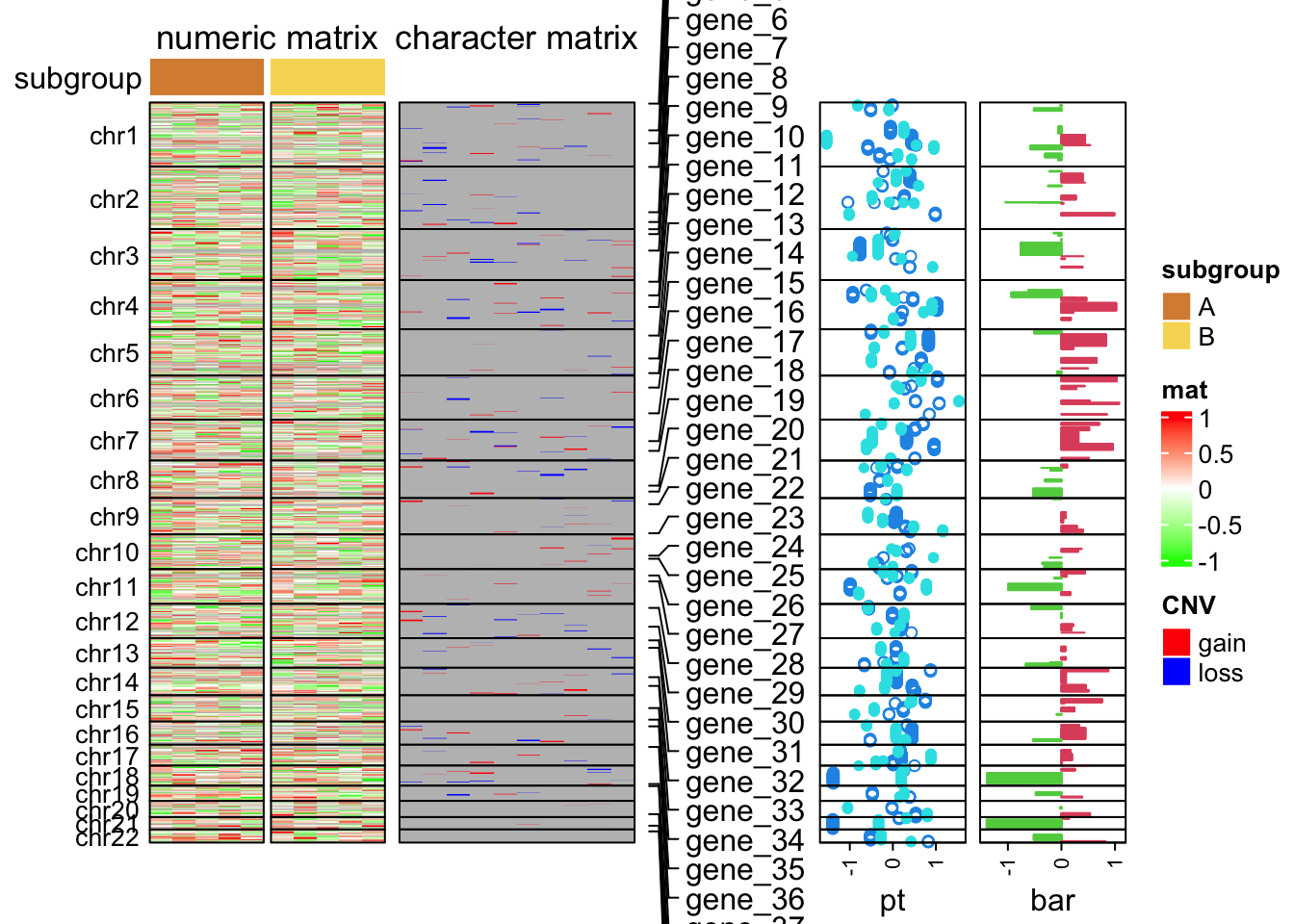
A work by Matteo Cereda and Fabio Iannelli